

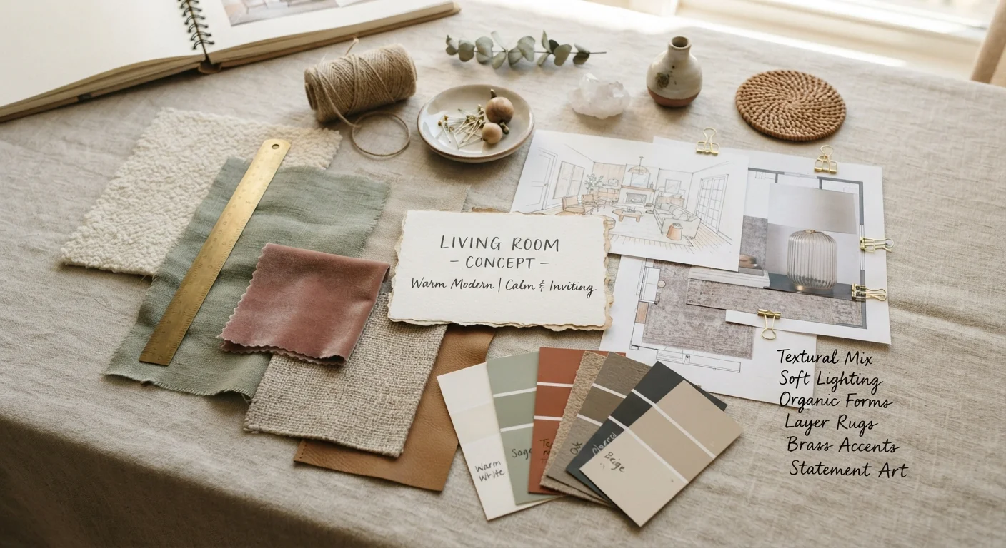
Why Decor Terminology Actually Matters
Ever read a room-styling article and stumbled over words like juxtaposition, vignette, or negative space? You're not alone. Decor vocabulary can feel like a private language - but once you crack the code, those terms become powerful tools. They help you diagnose what's off in a room, communicate with designers, and shop intentionally.
This plain-English reference gives you the definitions you'll encounter across virtually every decor resource, tutorial, or design show. Use it as a lookup guide before you start a project, or keep it open as you style your first room from scratch. The glossary below covers the terms we see cause the most confusion - along with quick-reference facts to anchor the concepts.
Negative Space
The intentional empty area around and between objects in a room. Negative space gives compositions breathing room, making styled vignettes and furniture arrangements easier to read visually.
Vignette
A small, curated grouping of objects - typically on a shelf, tray, or table - arranged to tell a visual story. Effective vignettes vary object heights and include a mix of textures and materials.
Juxtaposition
Placing contrasting elements side by side for visual interest or tension - for example, a rustic wood bench paired with a sleek chrome lamp. Juxtaposition prevents a room from feeling one-note.
Visual Weight
The perceived heaviness of an object based on its color, size, texture, and pattern rather than its actual physical mass. Dark, dense, or heavily patterned items carry more visual weight than light, airy ones.
Focal Point
The dominant feature a room is designed to draw the eye toward first - a fireplace, a statement wall, or an oversized piece of art. Every well-composed room has at least one clear focal point.
Scale
The size of an object relative to the room and to surrounding objects. Proper scale means furniture and decor are proportionally sized so nothing feels out of place or overwhelms its surroundings.
Proportion
The harmonious size relationship between multiple elements in a space. While scale compares objects to the room, proportion compares objects to each other - a small lamp on a massive desk lacks proportion.
Color Temperature
A way of describing how warm (reds, oranges, yellows) or cool (blues, greens, purples) a color reads. Warm colors tend to advance and energize a space; cool colors recede and calm.
Layering
Building depth in a room by stacking textures, patterns, and decorative elements at different heights and planes - rugs over floors, throws over sofas, art over consoles. Layering creates richness that flat styling lacks.
Rhythm
The repetition of a color, shape, or material throughout a room to create visual flow and cohesion. Rhythm guides the eye around a space and ties disparate elements together.
Grounding Element
An anchor piece - most often a rug - that defines the boundaries of a seating arrangement or functional zone within a room. A properly sized grounding element unifies the furniture around it.
Accent
A secondary color, texture, or decorative object used in small doses to add contrast or interest. Accents are typically the 10% element in a 60-30-10 color rule application.
Key Styling Concepts at a Glance
Beyond individual term definitions, it helps to understand how these concepts interact in a real room. A few principles do the heavy lifting in almost every well-styled space.
Balance and Visual Weight
Visual weight refers to how heavy or light an object appears - not its physical mass. Dark colors, large patterns, and dense textures all increase visual weight. A room feels balanced when weight is distributed evenly, whether symmetrically (matching nightstands on each side of a bed) or asymmetrically (a tall lamp balanced by a cluster of shorter objects).
Scale and Proportion
Designers talk about scale constantly because getting it wrong is the most common reason a room feels awkward. Oversized art in a cramped hallway, or a tiny rug under a substantial sectional, both break proportion. A general rule: furniture should occupy roughly two-thirds of a wall's width, and art should span at least half the width of the furniture it hangs above.
Layering Textures and Patterns
Layering prevents a room from feeling flat or showroom-stiff. Mix at least three textures - for example, a linen sofa, a jute rug, and velvet throw pillows - and keep patterns in varied scales (a large geometric, a medium stripe, a small print) so they don't compete. This is where many budget-friendly room makeover strategies punch far above their price point.
The Power of Negative Space
Negative space - the intentional empty areas in a room - gives the eye a place to rest. Overcrowded surfaces read as chaotic; strategic emptiness makes your favorite objects stand out. If a surface feels cluttered, remove everything and add back only what earns its spot.
When you're ready to apply these concepts in a structured way, our room styling checklist walks you through a before-and-after audit so you know exactly what to change first.
| 60-30-10 Color Rule | 60% dominant color, 30% secondary, 10% accent (Classic interior design guideline) |
| Recommended Art Placement Height | Center of artwork at approximately 57-60 inches from floor (Standard gallery and museum hanging convention) |
| Rug Sizing Guideline | Front legs of all seating on the rug, or all legs fully on the rug (Widely cited interior design best practice) |
| Vignette Object Count | Odd numbers (3, 5, 7) tend to feel more dynamic than even groupings (Design composition principle) |
| Texture Mix Minimum | At least 3 distinct textures per room for visual depth (Interior styling best practice) |
| Furniture-to-Wall Ratio | Sofa or key piece spans roughly two-thirds of the wall behind it (Proportion guideline used in residential design) |
The content on this site is for informational purposes only and is not a substitute for professional advice. Always consult a qualified professional for guidance specific to your situation.