

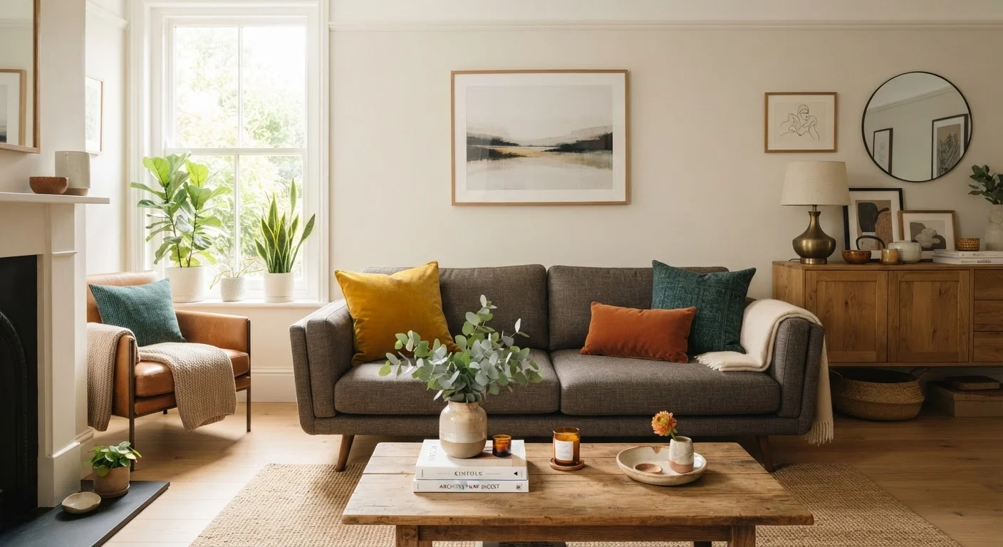
Where the Rule Comes From and Why It Works
The 60-30-10 ratio didn't originate in interior design - it migrated from graphic design and fashion, where managing visual hierarchy is fundamental. In a room, the same logic applies: the human eye needs a clear primary focus, a supporting element, and a detail-level accent to move through a space comfortably without feeling overwhelmed or bored.
Without any structure, most people default to one of two mistakes: they paint every wall white and add colour with dozens of small objects that never cohere, or they fall in love with a bold accent colour and use it so heavily it becomes exhausting. The 60-30-10 framework addresses both failure modes by assigning each colour a specific job. For a deeper look at how colour theory and undertones factor into room-specific decisions, see our room-by-room colour guide.
Percentages Are Estimates, Not Measurements
You don't need to calculate square footage to use this rule. The percentages reflect visual weight - how much a colour registers when you stand in the room and look around. A high-gloss secondary colour may read as more dominant than a matte wall even if it covers less area. Trust your eye over a tape measure.
Breaking Down Each Percentage
The 60% - Your Dominant Colour: This is the largest surface in the room. Walls are the obvious choice, but a large sectional sofa or an expansive area rug can carry this role just as effectively. This colour sets the room's overall mood, so most decorators keep it neutral or relatively muted - not because bold is wrong, but because 60% of a saturated colour is a lot to live with daily.
The 30% - Your Secondary Colour: This is the workhorse of the palette. It covers upholstered furniture, curtain panels, a prominent rug, or a significant furniture grouping. It should contrast or complement the dominant colour enough to be clearly distinct - a warm beige dominant paired with a dusty blue secondary, for example. The 30% creates the visual interest that stops a room from feeling flat.
The 10% - Your Accent Colour: Throw pillows, artwork, a lamp shade, small decorative objects, a vase. This is where you can take genuine risks - a saturated emerald green, a terracotta orange, a deep burgundy. Because the volume is low, even a bold accent colour reads as intentional rather than overwhelming. Swapping out these pieces is also the lowest-cost way to refresh a room when seasons change.
Applying It Without Buying Everything New
The practical value of this framework is that it maps onto what you already own. Before spending anything, do an audit: stand in the room and estimate which colours dominate your walls, your largest furniture pieces, and your accessories. If your 30% and 10% feel reversed - many small bold objects but no clear secondary anchor - the fix might be as simple as a new area rug or slipcover rather than a full repaint.
If you're planning a paint refresh, use the 60-30-10 structure to evaluate whether the new wall colour will still work with your existing sofa and accent pieces, or whether you need to budget for a few textile swaps too. Work through a room prep checklist before committing - testing swatches under both natural and artificial light is especially important when calibrating the dominant colour.
For rooms where you can't change the wall colour (rentals, for example), the secondary and accent tiers carry all the weight. A large, high-contrast rug becomes your de facto 30%, and layering textiles in a cohesive accent tone pulls the palette together even if the walls are builder white.
60%
Share of visual surface for the dominant colour
Interior designers consistently cite walls and large furnishings as the primary carriers of a room's dominant colour, typically accounting for the majority of perceived surface area.
~$50-$200
Typical cost to refresh the accent tier
Swapping throw pillows, a vase, or a small art print - the 10% accent layer - is generally the lowest-cost way to update a room's colour palette without repainting or replacing furniture.
When to Break the Rule - and How
Understanding a rule well enough to break it intentionally is the mark of confident decorating. Some designers flip the 60 and 30 deliberately - using a bold colour on the majority of surfaces to create a moody, enveloping effect. This works in dining rooms, home offices, and bedrooms more readily than in living rooms, where the dominant colour has to remain livable across long periods.
Others work in a near-monochromatic scheme where all three tiers share the same hue at different saturations - deep navy walls, medium blue upholstery, pale powder-blue cushions. The percentages still apply; only the contrast is reduced. This approach is forgiving for beginners and tends to read as sophisticated when the tonal transitions are gradual.
The 60-30-10 rule also pairs well with the rule of three in styling, which governs how you arrange objects within each accent tier. Together, they give you a framework for both colour balance and spatial composition - without requiring a design degree or a contractor's budget.
Frequently Asked Questions
Yes - the rule governs visual weight, not just flat colour. A patterned rug can count toward your 30% if it carries the secondary tone, and textured throw pillows contribute to your 10% accent layer. The key is to assess which colour reads most strongly in the piece.
You can extend the palette, but the structure still helps. Treat additional colours as sub-accents within the 10% tier, or swap one of your three anchors while maintaining the ratio. Rooms with four or more equally competing colours tend to feel chaotic, so keeping a clear dominant remains useful.
Absolutely - choose a light or neutral dominant colour for the 60% to keep the space feeling open. Reserve your secondary and accent tones for furniture and accessories, which you can move or swap without repainting. Lighter dominants make the ratio especially effective in compact spaces.
Not always, though it's the most common approach since walls cover the most surface area. In rooms with large sectional sofas or bold area rugs, those pieces may visually anchor the 60% even if the walls are lighter. Trust your eye - whichever colour you perceive first and most strongly is your dominant.
No - it's a tool, not a rule you're obligated to follow. Some designers prefer a monochromatic approach or deliberately use equal proportions for dramatic effect. The value of the 60-30-10 rule is that it gives first-time decorators a reliable starting point that avoids common colour imbalance mistakes.
The content on this site is for informational purposes only and is not a substitute for professional advice. Always consult a qualified professional for guidance specific to your situation.