

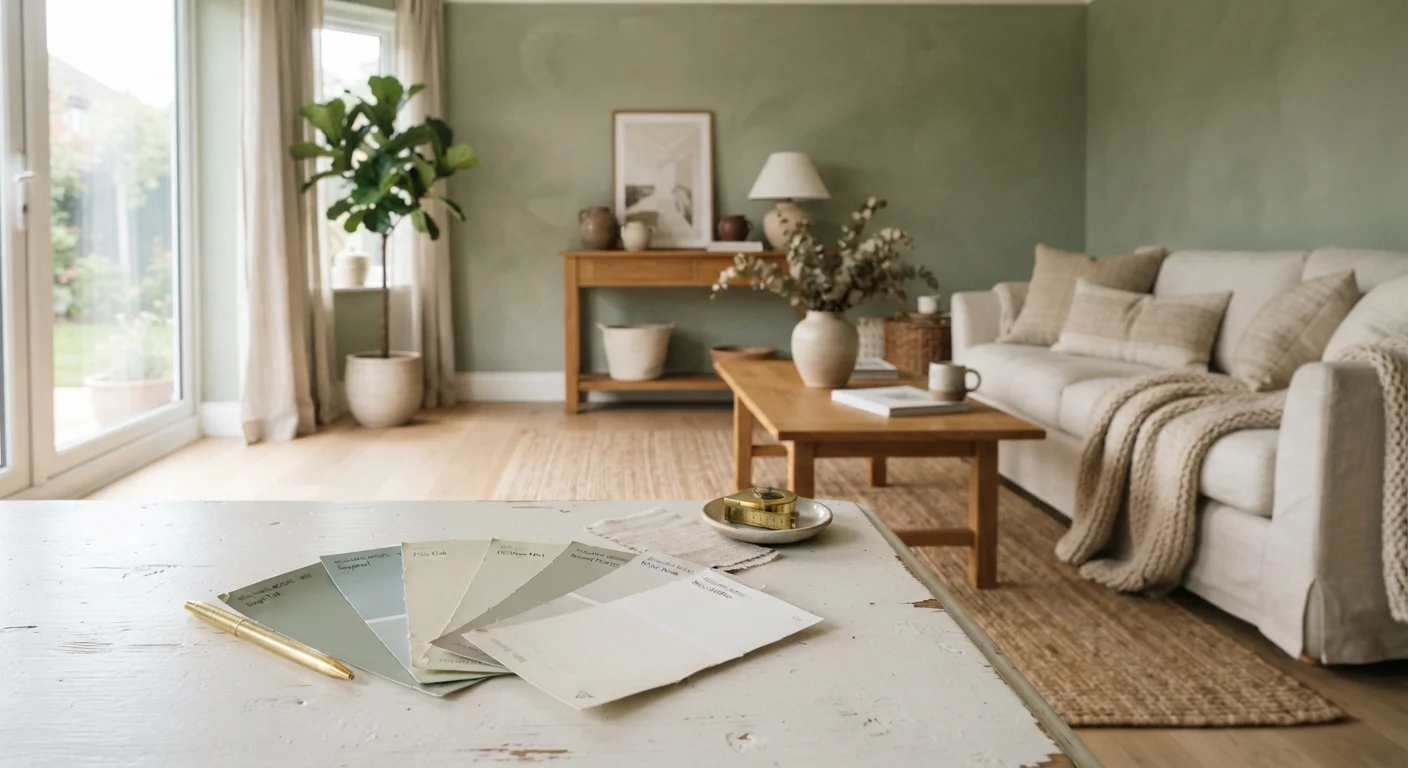
Why Colour Confidence Starts With the Basics
Picking a paint colour feels simple until you're standing in a room with seventeen swatches on the wall and none of them look like the chip in your hand. That gap between expectation and reality is where most colour decisions go wrong - not because the colour is bad, but because a few foundational concepts were skipped.
Colour theory doesn't need to be complicated to be useful. For decorating purposes, the concepts that matter most are hue (the pure colour family), value (how light or dark a tone is), and saturation (how vivid versus muted it appears). See our colour theory primer for home decorators for a deeper breakdown of these fundamentals. Once you understand how those three variables interact, choosing a palette becomes far less intimidating and far more intentional.
The most energising news: you don't need to overhaul a room to transform it. Strategic colour - on one wall, in textiles, or through carefully chosen accents - can completely shift a room's mood on a fraction of a renovation budget.
Understanding Undertones Before You Buy
Here's the detail that trips up even experienced decorators: every paint colour - including whites and neutrals - has an undertone. That subtle secondary hue is what makes one beige feel cosy and another feel institutional. Undertones typically lean warm (yellow, red, orange) or cool (blue, green, purple), and they interact powerfully with the light in your room.
A north-facing room receives indirect, cooler light, which will amplify cool undertones and can make blue-grays feel downright chilly. South-facing rooms bathed in warm afternoon light can bring out the golden undertones in a greige and make it glow. For a thorough guide to navigating neutral palettes, our article on warm versus cool neutrals covers how undertones affect mood and cohesion room by room.
It's also worth knowing that natural light shifts paint colour throughout the day - a tone that reads as a warm sand at noon can turn taupe by evening. That's not a flaw; it's physics. Plan for it by evaluating swatches across morning, afternoon, and lamp-lit evening conditions.
When comparing swatches, hold them against the largest fixed element in the room - your flooring or cabinetry - not against each other. The interaction between the paint and your existing surfaces is what you're actually evaluating.
Undertone clashes are most visible against fixed surfaces. Evaluating swatches in isolation gives an incomplete picture of how the colour will actually read in the finished room.
If a white feels too stark but you want brightness, try an off-white with a barely-there warm undertone - it photographs clean but feels far more liveable day to day.
Pure whites with blue undertones can feel cold and clinical in rooms with limited natural light. A subtle warm undertone softens the effect without sacrificing the sense of openness.
Paint a full-sized cardboard sheet with your chosen colour and move it around the room at different heights and angles before committing to the wall. This lets you assess the colour near the floor, mid-wall, and in corners where light behaves very differently.
Light varies significantly across a single wall - corners and lower sections receive less light and can make colours read several shades darker than expected.
Living Rooms: Bold Anchors and Flexible Accents
The living room is where colour can genuinely flex. Because it's a social, multi-use space, it benefits from a colour that energises without overwhelming. Think of your wall colour as the anchor and your furniture and soft furnishings as the flexible layer you can evolve over time.
Saturated tones like deep terracotta, forest green, or slate blue work beautifully as feature wall colours in living rooms with decent ceiling height - they add drama without closing the room in. In smaller or lower-ceilinged spaces, opt for mid-value tones in the same family: a dusty sage instead of a vivid emerald, or a soft clay instead of a brick red.
When it comes to accent tones - throw pillows, rugs, artwork frames, curtains - the living room is your playground. A warm neutral wall pairs surprisingly well with accents in navy, mustard, or rust because those tones share warm undertone families. If you want a structured approach to balancing these layers, the 60-30-10 colour rule gives you a reliable framework designers use to prevent any one tone from overpowering the space.
Bedrooms: Calm, Cohesion, and the Power of Soft Tones
Bedrooms benefit from colours that support rest rather than stimulation. That doesn't mean boring - it means intentional. Soft, desaturated tones in blue-greens, lavender-grays, and warm whites create environments that feel settled and easy on the eye after a long day.
One overlooked bedroom strategy: paint the ceiling a shade lighter than the walls in the same colour family. This technique draws the walls and ceiling into a cocoon-like relationship, adding visual height while maintaining warmth. It works especially well with dusty rose, pale sage, and warm off-whites.
For accent tones in the bedroom, lean into texture over contrast. A linen duvet in a tone one step warmer than your wall colour, layered with cushions in a muted complementary shade, reads as sophisticated rather than chaotic. Our guide on using texture as a design tool explores how layering materials can add depth even when your palette stays restrained.
Kitchens and Bathrooms: Finish Matters as Much as Colour
In high-moisture, high-traffic rooms like kitchens and bathrooms, paint finish is every bit as important as the colour itself. A flat matte might look gorgeous on a mood board, but in a kitchen it'll absorb grease and moisture and show every fingerprint. Eggshell or satin finishes offer a low sheen that's far more wipeable while still reading as a relatively soft surface.
For colour choices in these rooms, consider scale. A small bathroom in a deep navy with white trim can feel jewel-box glamorous rather than cramped if the fittings are kept light. A kitchen with white or light wood cabinetry can handle a bolder colour on a single accent wall or island without the whole room tipping dark.
Our guide to paint finish types walks through each sheen level - matte through high-gloss - and which surfaces they suit best. It's a quick read that can save you from a costly repaint.
Accent Tones: The 60-30-10 Framework in Practice
The 60-30-10 rule is a designer's shorthand for colour balance: 60% dominant colour (usually walls and large furniture), 30% secondary colour (medium furniture, rugs, curtains), and 10% accent colour (cushions, artwork, accessories, small décor). It's not a rigid law, but it's a remarkably reliable compass for rooms that feel pulled together without being matchy.
In practice, the 10% accent is where your personality shows up. A room with warm greige walls and natural oak furniture might get its accent punch from a set of deep plum cushions and a brass lamp - both of those items landing in the 10% category. Swapping out that 10% is also how you refresh a room seasonally without repainting.
If you're confident with pattern as well as colour, mixing prints within a colour palette follows similar principles of scale and contrast - well worth exploring once your base palette feels solid.
36%
Homeowners who repaint within 2 years
Industry surveys suggest a significant share of homeowners repaint sooner than expected, often citing undertone mismatch as the primary reason.
3-5 swatches
Recommended test patches per room
Interior design educators commonly recommend testing at least three to five colour variations per room to account for light variation and undertone interaction.
10%
Accent colour share in 60-30-10 rule
The 60-30-10 design ratio is a widely-cited guideline in interior design education for achieving visually balanced colour distribution in a room.
Testing Colours Before You Commit
No amount of online research replaces testing paint directly on your wall. Digital screens render colour differently across devices, and even physical chips read differently under store lighting than at home. The only reliable method is a generous swatch - ideally painted as a large rectangle directly on your wall - assessed across multiple times of day and under your room's artificial lighting at night.
Before you even reach the swatch stage, work through the practical questions: What direction does this room face? What's the primary light source at night? What fixed elements (flooring, cabinetry, existing furniture) does the new colour need to harmonise with? Our pre-paint room checklist helps you systematically work through every variable before you open a can.
And if a fresh coat of paint hasn't lifted your room the way you expected, it may not be the colour's fault. common prep and application missteps can undermine even the most carefully chosen colour - understanding them means you'll get the result your palette deserves.
This article is for informational purposes only. Paint results vary based on surface condition, application method, lighting, and individual perception. Always test colours in your own space before purchasing in full quantity.
The content on this site is for informational purposes only and is not a substitute for professional advice. Always consult a qualified professional for guidance specific to your situation.