

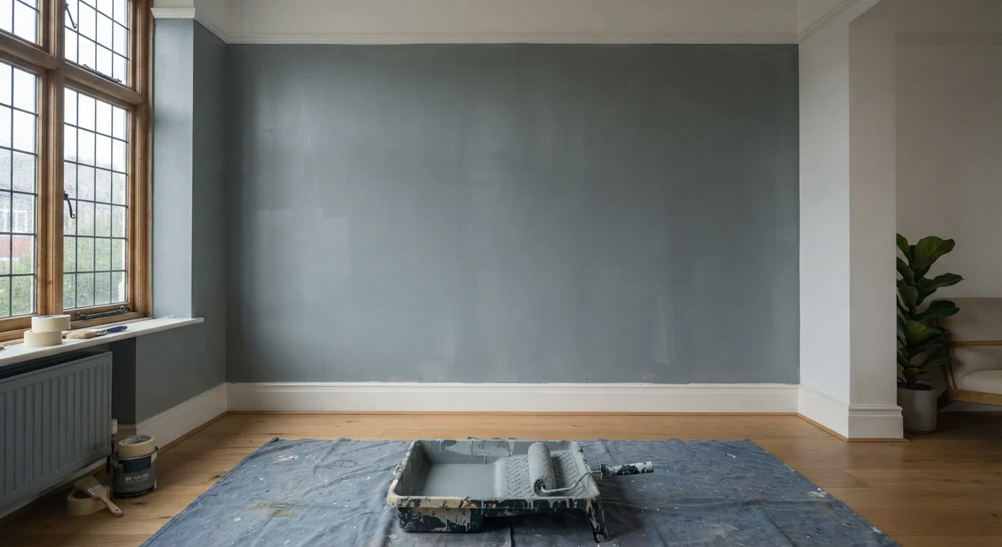
The Gap Between Colour Swatch and Finished Wall
You picked the colour carefully, bought a quality can, and put in the weekend work - but the room still looks off. The walls appear streaky, the colour feels muted, or the finish looks inconsistent from one end of the room to the other. This is one of the most frustrating outcomes in DIY home improvement, and it almost always traces back to a handful of repeatable mistakes made before or during application.
Understanding where things go wrong puts you in a position to correct them - either by revisiting the current job or getting it right on the next one. See our room prep and colour decision checklist for a structured walk-through before you open a can.
Skipping primer before applying topcoat colour.
Why it happens: Many paint cans are marketed as 'paint and primer in one,' which leads DIYers to skip a dedicated primer step, especially on tight timelines.
Applying paint over dirty, greasy, or inadequately sanded walls.
Why it happens: Walls that look clean to the eye often carry invisible layers of cooking grease, dust, or residue from old tape and wall anchors. It's easy to assume a quick wipe-down is sufficient.
Applying too few coats and expecting full coverage from one pass.
Why it happens: Paint coverage estimates on the can are based on ideal conditions. In practice, one coat rarely achieves consistent, saturated colour, especially with deeper or more saturated hues.
Overworking the paint by going back over partially dried areas.
Why it happens: The instinct to fix a visible lap mark or roller line while the paint is still 'wet' is natural, but latex paint begins skinning over within minutes. Brushing back into it drags the film and creates streaks.
Choosing the wrong sheen level for the room's light conditions.
Why it happens: Most people choose flat or eggshell by default without considering how their room's natural light will interact with the finish. A matte finish in a dim room can make even a vibrant colour look lifeless.
Surface and Sheen: The Two Factors Most People Underestimate
Even when application is solid, two underlying factors can quietly sabotage the result: surface condition and sheen selection.
Surface condition includes everything from unprimed patches to hairline cracks and residue left by old tape or cleaning products. Paint is not a filler - it follows and amplifies the texture beneath it. A wall with slight ridges, filler that wasn't sanded flush, or areas that were wiped with a waxy cleaner will show those flaws more clearly once colour is applied. Our guide on painting over patched walls covers exactly what to confirm before you reach for the roller.
Sheen level is frequently chosen by habit rather than intention. Flat and matte finishes absorb light and hide imperfections, making them suitable for ceilings and low-traffic walls - but they can make a colour feel heavier and less vibrant than the swatch suggested. Eggshell and satin sheens reflect slightly more light, which tends to bring colour to life and hold up better to cleaning. If your room feels duller than expected, the sheen may be pulling the colour down rather than the colour itself being the problem. Check out what the evidence says about paint quality assumptions before upgrading your can.
2-4 hrs
Minimum dry time between latex paint coats
Paint manufacturers generally recommend waiting at least two to four hours between coats under normal temperature and humidity conditions - longer in humid climates.
~80%
Of paint failures attributed to surface prep issues
Industry guidance from coating associations consistently points to inadequate surface preparation as the leading cause of premature paint failure and poor appearance.
Lighting is the final multiplier. A colour that reads warm and rich in the store under bright retail lighting can flatten into grey in a north-facing room. Test large swatches on the actual wall and observe them across different times of day before committing. For a deeper look at how room orientation and light temperature affect colour decisions, the room-by-room colour guide walks through undertones and room-specific considerations in detail.
The content on this site is for informational purposes only and is not a substitute for professional advice. Always consult a qualified professional for guidance specific to your situation.