

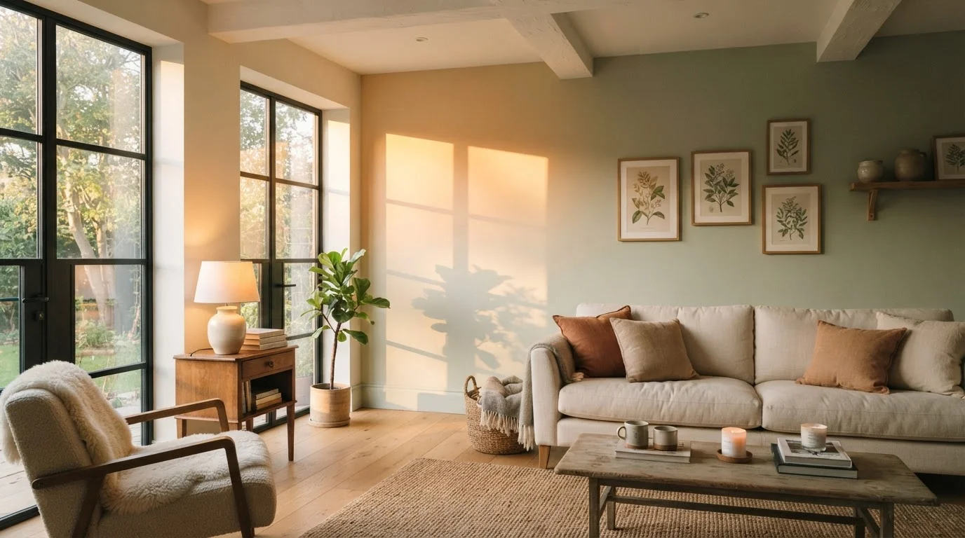
Why Light and Color Are Inseparable
Here's a scenario many homeowners know all too well: you fall in love with a soft sage green at the paint store, bring it home, roll it on the wall - and by late afternoon, it looks almost gray. Nothing went wrong with the paint. What changed was the light.
Color doesn't exist in isolation. What we see as color is actually reflected light, and the quality of that light changes constantly throughout the day. Morning sun delivers warm, golden light (lower on the Kelvin scale), midday light is the brightest and most neutral, and late-afternoon light shifts to amber before evening dims everything toward cool blue-gray. Each phase interacts differently with your paint's pigments and undertones.
Understanding this dynamic is foundational to choosing colors you'll love at 8 a.m. and 8 p.m. For a deeper dive into undertones and room-specific color principles, see our room-by-room color confidence guide.
How Room Orientation Shapes Your Color Experience
The compass direction your room faces is one of the most overlooked factors in paint selection - yet it defines the baseline quality of light your walls receive all day long.
- North-facing rooms receive indirect, diffused light with a cool, bluish cast throughout the day. Warm colors like terracotta or cream can look muddy; cool grays may appear stark.
- South-facing rooms are bathed in consistent, warm light that flatters almost any palette and keeps colors looking vibrant and true.
- East-facing rooms get soft warm morning light that fades to neutral or cool by afternoon - ideal if the space is used most in the morning.
- West-facing rooms experience the opposite: cooler mornings, then a dramatic amber glow in late afternoon and evening.
Knowing your room's orientation lets you anticipate how a color will behave before it ever goes on the wall. Our complete room-by-room paint color guide walks through orientation considerations for every space in your home.
~6500K
Color temperature of midday daylight
Midday sunlight registers around 6500 Kelvin - a cool, blue-white light that reveals paint colors closest to their 'true' pigment value.
~2700K
Color temperature of incandescent bulbs
Standard incandescent bulbs emit light near 2700 Kelvin, which is much warmer and can significantly shift how cool or neutral paint tones appear at night.
3-5x
Recommended swatch size vs. standard chip
Interior design educators commonly recommend testing swatches at least 12 inches square - several times larger than store chips - for an accurate in-room color assessment.
Undertones: The Hidden Variable
Every paint color has undertones - secondary hues embedded in the pigment that become visible under specific lighting conditions. A beige might carry pink, yellow, or green undertones. A white might lean lavender or peach. A gray might flirt with blue or violet.
These undertones are often invisible on a small chip in a store but become unmistakable on four full walls under shifting daylight. The cooler and less direct the light, the more cool undertones (blue, green, violet) assert themselves. Warm afternoon light tends to amplify warm undertones (red, yellow, orange).
This is why paint professionals consistently advise testing colors in the actual space at multiple times of day - not in the store, not by the window, and not from a tiny 2-inch chip. Use our pre-paint checklist to make sure you're catching undertone surprises before you commit.
Practical Strategies for Choosing Colors That Work All Day
Armed with an understanding of how light behaves, here's how to make smarter, more confident color decisions:
- Paint large test swatches directly on the wall. A minimum of 12×12 inches gives you a realistic read. Observe at morning, afternoon, and evening.
- Note your room's orientation and dominant light source. Factor this in before you even start pulling samples.
- Look for undertones intentionally. Hold the chip next to a true white and look for any color bias - that's the undertone revealing itself.
- Check your artificial lighting, too. Incandescent bulbs push warmth; cool LED or daylight bulbs can mimic midday sun. Your color needs to work under both.
- Consider the finish. Matte absorbs light (colors appear softer); satin and semi-gloss reflect it (undertones and shifts are more pronounced).
Choosing color isn't just about what you love in the abstract - it's about what works beautifully in your specific space, at all hours. If you're curious about common paint misconceptions that can trip up even seasoned DIYers, our piece on popular paint quality beliefs is worth a read before you buy.
This article is intended for general informational and educational purposes. Paint color perception can vary based on individual vision, room conditions, and product formulation. Always test colors in your specific space before making final decisions.
Frequently Asked Questions
Gray paints often contain undertones of blue, violet, or green that become pronounced when daylight fades and warm incandescent or LED light takes over. The cooler or lower-intensity the ambient light, the more those hidden undertones surface. Testing your swatch in the evening before buying is the best way to anticipate this.
Yes, significantly. North-facing rooms receive indirect, cooler light all day, which can make warm colors look muted and cool colors appear stark. South-facing rooms get abundant warm light that tends to flatter most palettes. East and west rooms experience dramatic morning and afternoon shifts respectively.
Test swatches at three distinct times: mid-morning, early afternoon, and early evening. Also observe them under your artificial lighting at night. Painting a large swatch (at least 12x12 inches) directly on the wall gives a far more accurate read than holding a small chip up to the light.
Neutral mid-toned colors - particularly those with balanced undertones rather than strong ones - tend to shift less dramatically. True whites, however, can be especially unpredictable. Consulting an undertone guide and testing thoroughly are your best tools for predictability.
Absolutely. Matte finishes absorb light and can appear darker or flatter as light fades. Satin and semi-gloss finishes reflect light, which can amplify color shifts and make undertones more visible at certain angles.
The content on this site is for informational purposes only and is not a substitute for professional advice. Always consult a qualified professional for guidance specific to your situation.