

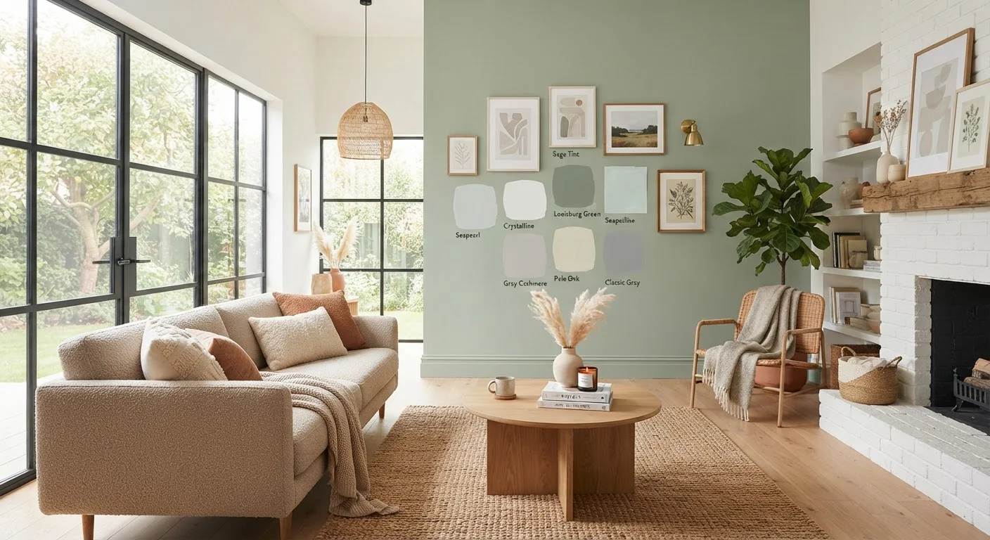
Why Room-by-Room Color Planning Matters
Choosing paint colors isn't just about picking shades you like - it's about designing an experience for every person who walks through the door. Color affects mood, perceived room size, appetite, and even sleep quality. A thoughtful, room-by-room approach ensures each space serves its purpose beautifully while the home reads as a cohesive whole.
The classic 60-30-10 rule offers a reliable starting framework: allocate roughly 60% of a room's color story to a dominant wall or background color, 30% to secondary surfaces like furniture or curtains, and 10% to accent details like throw pillows or art. This distribution prevents visual overwhelm and lets each color breathe. For broader color strategy - whether to go tonal or contrasting - check out monochromatic vs. complementary schemes.
36%
Homeowners who repaint before selling
According to the National Association of Realtors' annual remodeling impact surveys, interior painting consistently ranks among the top pre-sale improvements homeowners undertake.
2-3 shades
Variation swatches appear on wall vs. chip
Color professionals commonly note that paint looks 2-3 shades darker and more saturated on a full wall compared to a small sample chip under store lighting.
60-30-10
Classic interior color distribution rule
Interior design educators widely reference the 60-30-10 rule: 60% dominant color, 30% secondary, 10% accent, as a reliable framework for balanced rooms.
Understanding Light Before You Choose Any Color
Light is the single biggest variable in color selection - and it's the one most DIYers overlook. Natural light shifts throughout the day, and the orientation of your room (north, south, east, or west facing) dramatically influences how a color reads on the wall.
- North-facing rooms receive cooler, indirect light all day, which can make cool-toned colors feel stark. Warm whites and soft taupes tend to counteract this effect.
- South-facing rooms are flooded with bright, warm light - they can handle deeper, cooler shades without feeling gloomy.
- East-facing rooms catch warm morning light but cool off by afternoon, making them good candidates for soft, balanced tones.
- West-facing rooms glow amber in the evening - rich, warm colors really sing here.
Artificial lighting matters just as much. For a deep dive into matching bulb temperature to your chosen palette, explore our article on LED lighting from room to room.
Test Before You Commit
Purchase sample pots and apply generously to poster board or directly to the wall in two coats. Let the paint dry completely - wet paint reads darker and more saturated. View the patch morning, midday, and at night under your actual lighting before deciding.
Living Rooms: Set the Tone for the Whole Home
The living room is usually the first interior space guests encounter, and it sets expectations for the rest of the home. It needs to be welcoming, versatile, and livable across different times of day and lighting conditions.
Warm neutrals - think soft greiges, toasted linens, and gentle taupes - are perennially popular because they flex with accent colors in soft furnishings. If you want more personality, consider a single accent wall in a deeper, saturated hue (a moody navy, forest green, or terracotta) while keeping the remaining walls in a lighter, complementary tone. This approach adds drama without closing in the space.
Deciding between warm and cool base tones is one of the most consequential choices you'll make. Our warm vs. cool neutrals guide can help you narrow it down based on your room's light and existing furnishings.
Paint a large (at least 12×12 inch) sample patch directly on your wall and observe it at different times of day before committing - morning, noon, and evening light can reveal completely different undertones.
Small chips under fluorescent store lighting are notoriously misleading; in-situ testing eliminates costly regrets and is the single most reliable step in color selection.
When choosing a bedroom color, select your bedding and soft furnishings first, then pull a paint color from the fabric - not the other way around.
Fabric and textile colors are fixed; paint is infinitely adjustable. Anchoring to your textiles ensures harmony and prevents a mismatch between your new wall color and existing pieces.
Bedrooms: Color for Calm and Rest
Sleep science and color psychology both point in the same direction: cooler, desaturated hues generally support rest better than warm, high-energy tones. Soft blues, muted sage greens, pale lavenders, and hushed warm whites are consistently cited by interior designers as bedroom-friendly choices.
That said, deeply saturated colors - a rich plum, a dark slate blue - can feel luxuriously cocooning in bedrooms, especially when paired with warm lighting and soft textiles. The key is keeping the overall palette low-contrast so the eye isn't stimulated when you want to wind down.
Undertones Can Surprise You
A paint labeled 'warm white' can pull strongly pink or yellow on your walls depending on surrounding surfaces and light sources. Always check the undertone (the subtle secondary hue within a color) before buying a full gallon. Holding the chip against a pure white sheet is a quick way to reveal hidden undertones.
For inspiration on how to build a whole bedroom color story - walls, textiles, and accents - the Room Styling Tips hub is packed with practical ideas at every budget.
Kitchens and Dining Rooms: Energy Meets Appetite
Kitchens and dining rooms are active, social spaces, and color can amplify that energy - or dial it back, depending on your household's vibe. Warm whites, soft yellows, and earthy terracottas tend to feel inviting and appetite-stimulating. Crisp cool whites and pale grays give modern kitchens a clean, airy feel.
Deep colors - navy cabinetry against light walls, a dramatic black island, a rich hunter green on lower cabinets - have become a major design trend and can add serious sophistication to a kitchen without making it feel dark, especially when balanced with good lighting and reflective surfaces.
For dining rooms, slightly warmer, deeper hues than the adjacent kitchen can make evening meals feel intimate and special. Even a single painted wall behind the dining table creates a focused, gallery-like backdrop for the space.
Always factor in your cabinet and countertop colors - these are fixed elements the paint needs to complement, not compete with. Check the undertones of your existing finishes before selecting wall paint. Our full colour confidence guide covers undertone reading in detail.
“Color is a power which directly influences the soul. It is the keyboard, the eyes are the hammers, and the soul is the piano with many strings.”
— Wassily Kandinsky, Artist and influential theorist of color psychology in design
Bathrooms: Small Spaces, Big Color Decisions
Bathrooms present a unique challenge: they're often small, subject to humidity, and lit with artificial light. The finish you choose is as critical as the color itself - semi-gloss and satin finishes hold up to moisture and wipe down easily, making them the practical choice for most bathroom walls. Learn more in our guide to paint finish types and when to use each.
Color-wise, bathrooms can go in two effective directions: light and airy (soft whites, pale aquas, blush) to maximize the sense of space, or bold and immersive (deep teal, charcoal, inky navy) to create a spa-like or jewel-box effect. The latter works especially well in powder rooms where the small square footage becomes an advantage - it's a conversation piece, not a design liability.
Open-Plan Spaces Need Extra Planning
If your living, dining, and kitchen areas flow together without walls, a single dominant color ties them visually - but slight shifts in tone or accent colors can still define each zone. See our guide on color zoning in open-plan spaces for detailed strategies.
Creating Flow: Color Across the Whole Home
A home where each room exists in its own color bubble can feel choppy and disjointed. The solution is a whole-home palette - typically one or two anchor neutrals used consistently in hallways, trim, and ceilings, with rooms branching off into their own accent colors that share undertones with the anchors.
Hallways and staircases, which transition between rooms, benefit from colors that bridge neighboring spaces. If your living room is a warm greige and your bedroom is a soft sage, a hallway in a soft warm white creates a natural, harmonious bridge.
Consider the view from room to room: when doors are open, do the colors clash or complement? Walking your home with paint chips held together at sightlines is a surprisingly effective editing technique. For inspiration on giving every room in your home a cohesive upgrade - color included - explore our room makeovers hub for budget-conscious transformations.
This article is intended for general informational and educational purposes. Paint performance, color appearance, and finish durability will vary based on product, surface preparation, application method, and environmental conditions. Always follow manufacturer instructions and verify local building or HOA guidelines before beginning any painting project.
The content on this site is for informational purposes only and is not a substitute for professional advice. Always consult a qualified professional for guidance specific to your situation.