

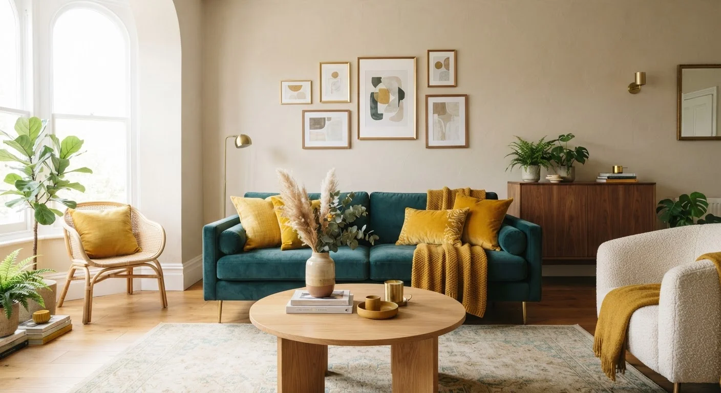
Why Color Proportion Matters More Than Color Choice
Most people agonize over picking the right colors, when the real secret to a pulled-together room is using colors in the right amounts. Even a beautiful palette can fall flat - or feel chaotic - if the proportions are off. That's exactly the problem the 60-30-10 rule solves.
Think of it like seasoning a dish. Salt alone isn't a meal, and dumping equal amounts of every spice you own produces something overwhelming. The right balance of bold and subtle, dominant and supportive, is what makes the final result satisfying. The same logic applies to color in a room.
This principle is closely connected to how visual weight works in interior styling, which explains why certain rooms feel naturally settled while others seem restless, even when you can't pinpoint why.
60%
Dominant color coverage in a balanced room
The 60-30-10 formula is a widely cited interior design guideline used by professional decorators to proportion color across walls, furniture, and accessories.
10%
Accent color - the smallest but boldest share
Design educators note that accent colors are most impactful precisely because they occupy less space, making even high-saturation shades feel intentional rather than overwhelming.
3
Color tiers in the standard rule
Using three distinct color roles - dominant, secondary, accent - mirrors principles found across art, fashion, and graphic design for creating visual hierarchy.
Breaking Down the Three Layers
60%: The Dominant Color
This is your room's backbone - the tone that sets the overall mood. It typically covers walls, large area rugs, and major upholstered pieces like a sofa or sectional. Because it occupies the most visual space, the dominant color should feel livable and calm rather than attention-grabbing. Neutrals, soft earth tones, warm whites, and muted greens are perennial favorites here, though deep, moody dominants work beautifully in rooms with strong natural light.
30%: The Secondary Color
The 30% layer adds dimension and visual rhythm. It shows up in curtains, accent chairs, a bedspread, or even a painted piece of furniture. This color should complement or thoughtfully contrast your dominant tone - not match it exactly. If your dominant color is warm greige, your secondary might be a rich caramel or a soft dusty blue. This tier is where a room starts to develop a personality beyond its base.
10%: The Accent Color
This is the fun part. The 10% accent is where you bring in bolder choices - the saturated teal throw pillow, the terracotta vase, the emerald lampshade. Because it covers so little surface area, your accent can be far more daring than you'd dare to paint an entire wall. Swap out accent pieces seasonally to keep a room feeling fresh without touching the underlying palette.
Applying the Rule to Real Spaces
The 60-30-10 formula works across every room type, though how it maps to specific surfaces varies. In a bedroom, the dominant color might live on the walls and bed frame, the secondary in bedding and a upholstered headboard, and the accent in decorative pillows, art, or a bedside lamp. In an open-plan kitchen-living area, anchoring each zone with a consistent dominant color (even if secondary and accent tones differ slightly) creates flow rather than visual clutter.
Patterns play beautifully within this system too. A patterned fabric on a sofa can carry two colors at once - identify which hue dominates and use that to guide how it fits into the 30% or 60% tier. For a deeper dive into understanding hue relationships before building your palette, color theory basics for home decorators is a solid foundation.
When (and How) to Bend the Rule
The 60-30-10 rule is a starting point, not a law. Maximalist interiors, eclectic styles, and bold design movements deliberately stretch or flip these proportions - and that's entirely valid. The key is understanding why the rule works before you decide to ignore it. Knowing the principle means you break it with intention, not accident.
One common and effective variation is shifting to a 50-30-20 split - giving slightly more weight to the secondary color, which works well in rooms that benefit from a more dynamic, energized feel. Another approach is using the dominant tone as a near-neutral and letting the secondary carry richer color, effectively inverting the traditional hierarchy.
For practical room-by-room color guidance that builds on this foundation, this room-by-room color and paint guide walks through how different spaces respond to different palette strategies.
Frequently Asked Questions
It's a color distribution formula that splits a room's palette into 60% dominant, 30% secondary, and 10% accent colors. The ratio helps ensure rooms feel balanced rather than chaotic or flat. Most professional designers use it as a starting point for any new space.
Absolutely. The rule applies to the visual weight of color regardless of whether it appears in solid paint, a patterned fabric, or a textured wallcovering. Identify the dominant hue in your pattern and treat it as the 60% color when planning your palette.
Yes, and it's especially useful in small spaces where color choices have an outsized visual impact. Keeping the 60% tone light and airy opens a room up, while a saturated 10% accent adds interest without making the space feel cramped.
Start with the color you want the room to feel, then assign it the 60% slot. Choose a secondary tone that complements or contrasts it pleasingly for the 30%. Reserve the boldest or most saturated color for the 10% accent role.
You can, but the 60-30-10 principle still helps - simply group your additional colors within the existing tiers. For example, you might use two different accent colors that together make up your 10%, keeping the overall balance intact.
Not exactly. A color scheme (like complementary or analogous) describes the relationship between your chosen hues. The 60-30-10 rule describes how much of each hue to use. The two concepts work together: pick your scheme first, then apply the ratio.
The content on this site is for informational purposes only and is not a substitute for professional advice. Always consult a qualified professional for guidance specific to your situation.