

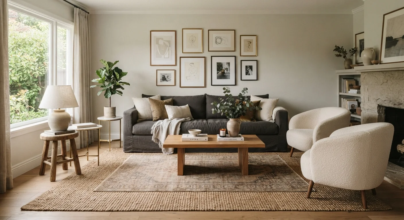
Why Rooms Feel 'Off' Even When Everything Is Nice
You've rearranged the cushions. You've added a plant. You've even bought a new lamp. And still - the room just doesn't feel right. Sound familiar? The culprit is almost always visual weight imbalance, and it's one of the most overlooked principles in home styling.
Visual weight isn't about physical mass. It's about perception. Some objects command attention the moment you walk into a room; others quietly recede. When the heavy hitters all land in the same corner, zone, or wall, your eye senses the imbalance - even if your brain can't name it. The result: a space that feels cluttered on one side, empty on the other, or simply restless.
The good news? Once you understand what drives visual weight, you can diagnose and fix imbalance without spending a cent - just by rearranging what you already own.
What Gives an Object Visual Weight?
Several qualities determine how much visual pull an element has:
- Color and value: Dark, saturated colors feel heavier than light ones. A charcoal sofa reads as far weightier than an identical cream one.
- Size and scale: Larger objects carry more weight - but small objects clustered together can match the pull of a single large piece.
- Texture and pattern: Rough, layered, or highly patterned surfaces attract more visual attention than smooth, plain ones. A bouclé chair outweighs a linen one of equal size.
- Contrast: An object that contrasts sharply with its background - a dark frame on a white wall - draws the eye more forcefully than something that blends in.
- Shape complexity: Ornate, irregular shapes feel heavier than simple geometric ones.
Understanding these levers lets you make intentional choices. If one side of your room feels too light, you don't need more furniture - you might just need a darker throw, a patterned cushion, or a piece of art with more contrast.
Symmetrical vs. Asymmetrical Balance - and When to Use Each
Balance doesn't mean matching lamps on either side of a bed (though there's nothing wrong with that). There are two main approaches:
Symmetrical Balance
Mirror-image arrangements on either side of a central axis. Think matching nightstands, identical armchairs flanking a fireplace. It feels formal, calm, and instantly ordered - great for bedrooms and traditional living rooms. The downside: it can feel rigid if overdone.
Asymmetrical Balance
Different elements with equivalent visual weight placed in a way that still feels harmonious. A large sofa on one side balanced by a tall floor lamp plus a textured side table on the other. This approach feels more dynamic, casual, and contemporary - and it's often easier to achieve with a mismatched collection of furniture and decor.
Most well-styled rooms actually blend both. A symmetrically arranged seating area might be balanced by an asymmetrical gallery wall across the room.
The Squint Test for Visual Balance
Stand in the doorway of your room and squint until the details blur. What you see are blocks of light, dark, and mid-tone. If the darks all cluster in one area, that's your imbalance point. This low-tech trick mimics how designers assess compositional weight before making any changes.
Common Imbalance Mistakes and How to Fix Them
Here are the most frequent visual weight problems - and practical fixes that don't require a renovation:
- All the dark pieces on one wall
- Scatter anchoring elements - darker rugs, bold art, or rich-toned cushions - around the room so no single zone dominates.
- Art hung too small for the furniture below it
- A tiny print above a large sofa looks like an afterthought. The art's visual weight should feel proportionate to the furniture beneath it. A gallery grouping can solve this without buying a single large piece.
- Every piece the same height
- Visual weight stacks horizontally and vertically. Varying height - tall plant next to a low table, layered shelving at different levels - moves the eye around the room and creates balance across the vertical plane.
- Heavy window treatments on just one wall
- Thick, dark drapes can tip a room's weight dramatically. If windows only exist on one wall, counterbalance with a substantial mirror, art cluster, or textured wall treatment on the opposite side.
For small spaces especially, these adjustments can be transformative. See our styling strategies for small rooms for more targeted techniques.
~60%
Of a room's perceived comfort tied to layout
Interior design research consistently suggests that furniture arrangement and spatial balance - not color or decor alone - are primary drivers of how comfortable a room feels to occupants.
3x
Greater eye attention to high-contrast elements
Studies in visual perception indicate that high-contrast objects (dark against light) attract significantly more fixations and hold attention longer than low-contrast equivalents in the same scene.
Putting It All Together
The next time a room feels unsettled, try this quick audit: stand in the doorway and squint slightly. Where does your eye land first? Where does it linger? Where does it want to go next but find nothing? Those answers reveal your imbalance points.
Visual weight works hand-in-hand with other design principles. The 60-30-10 color rule distributes color weight across a room by proportion. The rule of three in styling groups objects so they register as a single weighted cluster rather than scattered noise. And if an accent wall is throwing your room off, our guide on why accent walls feel off walks through the most common culprits.
Visual balance is less about perfection and more about intention. Once you train your eye to sense weight, you'll find that small, free changes - repositioning a chair, swapping a rug, rehaning art - can transform a room that's been nagging at you for months.
Frequently Asked Questions
A room feels heavy when too many dominant elements - dark colors, large furniture, bold patterns - cluster in one area. The eye scans the room and finds no counterweight on the other side, creating a sense of tension or incompleteness. Redistributing these elements, or adding lighter counterpoints, typically resolves the issue.
No. Symmetrical balance mirrors elements on either side of a central axis, but asymmetrical balance - using different objects with equivalent visual weight - is equally valid and often more dynamic. A large plain sofa can be balanced by a cluster of smaller, highly textured accessories on the opposite side.
Darker, richer colors feel heavier than lighter ones. A navy accent wall will draw the eye strongly, while a pale blush wall recedes. This means a single dark piece can anchor a room, but placed poorly, it can pull all focus to one corner. The <a href="/home-decor-ideas/color-and-pattern-play/the-60-30-10-rule-how-interior-designers-balance-color-in-a-room">60-30-10 color rule</a> is a practical framework for distributing color weight intentionally.
Absolutely. A chunky knit throw, a highly patterned rug, or a rough stone vase all register as visually heavier than their smooth or plain counterparts. Layering textures strategically lets you add weight to a lighter area of a room without introducing darker colors.
Bottom-heavy rooms usually have large, dark furniture with nothing drawing the eye upward. Try hanging artwork higher, adding tall floor lamps or plants, or introducing open shelving with decorative objects. Drawing vertical lines pulls visual weight up and creates a more balanced feel.
They're related but distinct. Visual weight describes how much perceptual pull each element has. Visual balance is what you achieve when weight is distributed in a way that feels harmonious. Think of visual weight as the ingredient and visual balance as the goal.
The content on this site is for informational purposes only and is not a substitute for professional advice. Always consult a qualified professional for guidance specific to your situation.