

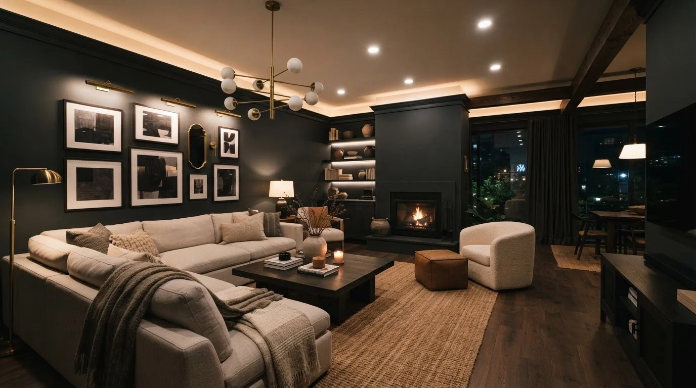
The Myth That Won't Die - And Why It Persists
Ask almost anyone what color to paint a small room and the answer comes back instantly: light colors, of course. The assumption that dark walls shrink a room is so embedded in popular decorating wisdom that it rarely gets questioned. But it's a half-truth - and acting on half-truths is how rooms end up feeling flat, cold, or simply uninspired.
The reality is more interesting. Dark paint doesn't automatically compress space. It changes contrast - and contrast is what defines spatial perception. When contrast between surfaces is high (bright white walls, dark wood floor, white ceiling), the boundaries of a room are sharply defined. When contrast is low (deep teal walls, medium floor, coordinating ceiling), those boundaries blur. That blurring is what creates the sensation of a room that seems to extend beyond its actual edges.
For practical strategies that work alongside paint choices, our small room styling guide covers budget-friendly approaches that complement your color decisions.
Myth
Dark paint always makes a room feel smaller and more closed-in.
Fact
Dark paint can make a room feel larger when applied consistently and paired with appropriate lighting.
The idea that dark walls automatically compress a space is one of the most repeated decorating myths. What dark paint actually does is reduce the contrast between a room's surfaces - and lower contrast makes boundaries feel less defined. When walls, ceiling, and trim are all painted in close tonal range, the eye struggles to pinpoint where one surface ends and another begins, which can create a sense of expansiveness. Interior designers sometimes call this an enveloping effect: the room wraps around you rather than boxing you in.
The caveat is consistency. A single dark accent wall against white trim and a white ceiling will tend to feel heavier and smaller. The spatial magic happens when the dark palette is extended - or at least coordinated - across multiple surfaces.
Myth
Light colors are always the safest choice for small rooms.
Fact
Light colors improve perceived space only when lighting and contrast are managed carefully - they're not a guaranteed fix.
White and cream walls reflect more light, but if a room has limited natural light or harsh overhead lighting, those bright walls can look washed-out and flat rather than spacious. Flat, uninteresting surfaces don't fool the eye into perceiving depth. Meanwhile, a deeply pigmented paint color in a room with layered lighting - sconces, floor lamps, table lamps - can create the kind of shadow and depth that actually implies volume.
See how other spatial tactics stack up in our guide to spatial tricks that actually work, because paint color is only one variable in the perception-of-space equation.
Myth
Dark ceilings always feel oppressive and low.
Fact
A dark ceiling can make a room feel more dramatic and intimate without significantly lowering perceived ceiling height when done thoughtfully.
Ceiling color is the most underused tool in residential decorating. Painting a ceiling in a deep navy, forest green, or charcoal - especially while keeping walls in a mid-tone or lighter shade - draws the eye upward and creates a sense of drama that reads as intentional rather than accidental. The contrast between a dark ceiling and lighter walls can actually emphasize the vertical dimension of a room.
Where this backfires: if the ceiling is already genuinely low (under about 8 feet) and the room has very little natural light, a dark ceiling combined with dark walls and minimal lighting can tip the balance toward oppressive. Context matters enormously.
Myth
Paint finish doesn't matter - only the color does.
Fact
Matte finishes absorb light and make dark colors recede; high-sheen finishes reflect light and can make dark walls look reflective and larger.
The finish is arguably as important as the hue itself. A flat or matte finish on a dark wall absorbs light, which minimizes glare and makes the surface appear to recede - enhancing that boundary-dissolving effect. A satin or semi-gloss finish on the same color will catch and bounce light differently, which in some rooms creates an energizing reflective quality but in others can highlight surface imperfections and feel busy.
If you're painting a dark color specifically to expand perceived space, matte or eggshell finishes tend to serve that goal more reliably. If your goal is richness and drama over pure spatial illusion, satin can be a beautiful choice. See our article on why freshly painted rooms sometimes still look dull for more on how application and prep affect the final result.
Myth
The rule 'dark recedes, light advances' is an absolute law of decorating.
Fact
This principle from color theory is real but context-dependent - scale, light source, and adjacent colors all modify the effect.
Color theory does establish that darker hues tend to visually recede while lighter hues advance toward the viewer. But this is a perceptual tendency, not a rigid rule. The effect depends on the light source (natural vs. artificial, warm vs. cool), the colors of adjacent surfaces and furnishings, and the overall scale of the room. A small sample chip on a white card at a paint store can look very different once it covers four walls under incandescent lighting surrounded by warm wood furniture.
Understanding visual weight principles helps you anticipate how a color will behave in your specific space rather than relying on universal rules that don't always hold.
When Dark Walls Actually Do Shrink a Room
The myth earns its staying power because dark paint genuinely can make a space feel smaller - under the wrong conditions. Knowing those conditions helps you make an informed decision rather than a blind leap.
Poor Lighting Undermines Dark Paint Every Time
Before committing to a dark wall color, audit your room's lighting. Dark pigments absorb light rather than reflecting it, so any existing lighting deficiency will be amplified after painting. Plan for layered light sources - ambient, task, and accent - before or alongside your painting project. A beautifully chosen dark color in an under-lit room will almost always read as gloomy rather than dramatic.
The biggest risk factor is inadequate lighting. Dark walls absorb light rather than reflecting it, which means a room that already struggles with dim natural light can feel noticeably darker - and by extension, smaller - after a deep-color paint job. If your room has one small north-facing window and relies heavily on overhead lighting, dark paint requires a deliberate and layered lighting plan to succeed.
The second risk factor is inconsistent application. Painting only one wall dark while keeping the others and the ceiling white is the scenario most likely to produce that heavy, caved-in feeling. The dark surface draws the eye without dissolving the boundaries, making the room feel asymmetrical rather than dramatic. For a deeper dive into color behavior in small rooms specifically, our article on dark paint in small rooms separates myth from verifiable result.
Furniture scale compounds both issues. Oversized, dark-upholstered furniture in a dark-walled room with poor lighting can eliminate any visual breathing room entirely - even in a space that might otherwise have benefited from the paint choice.
~60%
Of perceived room size is influenced by lighting
Lighting designers generally attribute the majority of how spacious a room feels to light quality and distribution, not wall color alone.
3-4
Lighting layers recommended for dark-painted rooms
Design professionals typically recommend ambient, task, accent, and natural light sources to counterbalance the light-absorbing properties of dark wall colors.
The content on this site is for informational purposes only and is not a substitute for professional advice. Always consult a qualified professional for guidance specific to your situation.