

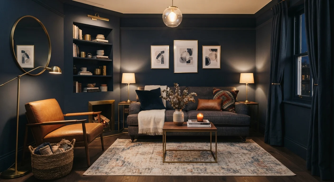
The Stubborn Myth Holding Your Palette Hostage
Ask almost any first-time decorator what color to avoid in a small room and the answer comes fast: nothing dark. It's one of the most repeated rules in home styling - and one of the most misunderstood. The fear that a deep forest green or midnight navy will swallow your spare bedroom whole has kept countless walls painted the same safe off-white for decades.
But decorating rules aren't physics laws. The relationship between wall color and perceived space is more nuanced than a single shade on a paint chip. Understanding what's actually happening - visually and psychologically - can free you to make bolder, more intentional choices. See how dark walls interact with space perception for a deeper look at the science behind the effect.
Below, we tackle the most common myths head-on so you can approach your next small-room project with confidence rather than color anxiety.
Myth
Dark paint always makes a small room feel smaller and more cramped.
Fact
Dark colors can create a sense of intimacy and depth that actually makes boundaries feel less defined, not more confining.
This myth treats all visual perception as a simple equation: light equals spacious, dark equals cramped. In reality, when walls, ceiling, and trim share a similar deep tone, the edges of a room become harder to distinguish. That dissolution of hard boundaries can make a space feel more expansive - or at least more enveloping in a deliberate, cozy way. The effect depends heavily on lighting, contrast with furnishings, and finish level.
Myth
You should never paint the ceiling dark in a small room.
Fact
A dark ceiling painted to match the walls removes the visual 'lid' from a room and can make the space feel more continuous and immersive.
The conventional advice to keep ceilings white stems from the idea that a pale ceiling mimics open sky. But in a small room, a stark white ceiling against dark walls actually emphasizes the contrast, making the ceiling feel low and the walls feel like they're closing in. When you carry the wall color onto the ceiling - especially in a matte finish - the room wraps around you rather than boxing you in. Many interior designers intentionally use this technique in dining rooms and studies.
Myth
Dark rooms are always gloomy and hard to live in day-to-day.
Fact
Gloom is a lighting problem, not a paint problem - the right layered lighting plan makes dark rooms feel atmospheric and livable.
A dark room with a single overhead bulb will feel dingy regardless of how skillfully the color was chosen. The same room with layered lighting - table lamps, sconces, candles, and strategic natural light - can feel warm and sophisticated. Many people who live with dark walls report that the spaces feel calming and restful rather than oppressive. The paint color sets the stage; lighting determines the mood.
Myth
Light colors are always the safest, best choice for a small room.
Fact
Light colors reduce contrast and can make a poorly lit or cluttered small room feel bland and visually noisy rather than spacious.
Pale walls reflect light, which helps in a bright, well-organized room - but they also reflect visual clutter. In a small room filled with mismatched furniture or limited natural light, white or cream walls can actually highlight disorder and feel flat. A dark, saturated color can unify a space visually, making varied furnishings read as a cohesive whole rather than a chaotic mix. For rooms used primarily in the evening, the argument for pale walls weakens further.
Myth
Once you paint a room dark, it's nearly impossible to paint back over it.
Fact
A quality primer followed by two coats of a lighter color is usually sufficient to cover most dark paints with good results.
The fear of being 'locked in' to a dark choice keeps many decorators from experimenting. In practice, a dedicated high-hide primer - tinted to an intermediate shade between the dark and the target light color - significantly reduces the number of topcoats needed. While covering very deep colors can require extra coats compared to repainting a lighter wall, it is a straightforward process and not the irreversible commitment many assume. Common assumptions about paint quality and priming are worth examining before your next project.
Making Dark Colors Work in Real Rooms
Knowing the myths is one thing - executing the look is another. A few practical principles make the difference between a dark room that feels like a jewel box and one that just feels dingy.
~10%
Light absorbed by matte dark paint vs. light walls
Matte dark finishes can absorb significantly more light than pale walls, making supplemental lighting a critical planning step rather than an afterthought.
3-4 layers
Coats typically needed to cover deep dark paint
Industry painting guides generally suggest using a tinted primer to reduce the number of topcoats required when transitioning from very dark to very light colors.
Light Is Your Most Powerful Tool
Dark walls absorb more light than pale ones, so your lighting plan needs to compensate. Layer multiple sources - overhead, task, and ambient - rather than relying on a single ceiling fixture. Wall sconces and uplighting in particular draw the eye upward and add dimension that counteracts any closing-in effect. For more actionable ideas that pair well with bold color choices, explore our small-room styling strategies.
Furniture Scale and Contrast Still Count
Oversized, dark furniture against dark walls can blur together in a way that genuinely flattens a space. Lighter upholstery, natural wood tones, or metallic accents create contrast that keeps individual elements readable. That visual separation is what gives a room its sense of depth. The spatial tricks that genuinely hold up - like mirrors and furniture scale - pair especially well with bold wall choices.
Finish Matters More Than You Think
A flat or matte finish on dark paint absorbs light and softens the color's intensity, lending a sophisticated, velvety look. A satin or eggshell finish on the same color will reflect more light and feel slightly lighter in the room. Neither is wrong - they're different tools. And if your freshly painted dark room still feels flat, the culprit may be prep or application rather than the color itself; common painting missteps are worth reviewing before you repaint.
The content on this site is for informational purposes only and is not a substitute for professional advice. Always consult a qualified professional for guidance specific to your situation.