

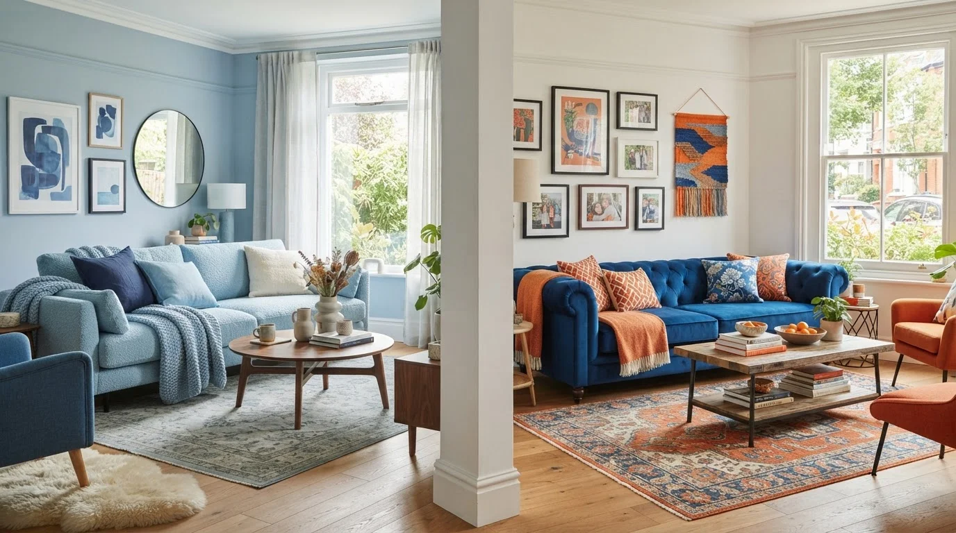
Our Verdict
Both monochromatic and complementary color schemes reliably produce pulled-together rooms when applied with intention. Monochromatic palettes reward patience and texture layering, delivering serene and sophisticated results. Complementary schemes reward boldness and are ideal when you want a room to spark energy and visual interest.
| Best for | Recommended |
|---|---|
| Those who prefer calm, spa-like environments | Monochromatic |
| Decorators who want dramatic visual impact in social spaces | Complementary |
| First-time DIYers nervous about color mistakes | Monochromatic |
| Rooms that need to feel larger and more unified | Monochromatic |
Understanding the Two Approaches
Every well-styled room starts with a color strategy, and two of the most dependable methods come straight from the color wheel. Monochromatic schemes build an entire palette from a single hue - pulling in its lighter tints, deeper shades, and grayer tones to create layered depth without contrast. Complementary schemes instead pair two hues sitting directly opposite each other on the color wheel, such as blue and orange or violet and yellow, creating inherent visual tension that energizes a space.
Neither method is universally superior. Each delivers a distinct emotional register, and choosing between them depends on the room's function, its natural light, and your own comfort level with color risk. For a thorough grounding in how undertones and light affect any palette choice, see our room-by-room color confidence guide.
| Monochromatic | Complementary | |
|---|---|---|
| Color wheel basis | Single hue in varied tints/shades | Two opposite hues on color wheel |
| Mood created | Calm, serene, sophisticated | Energetic, vibrant, dynamic |
| Difficulty level | Beginner-friendly | Intermediate - requires balance |
| Best room types | Bedrooms, offices, small rooms | Living rooms, dining rooms, kitchens |
| Key design tool | Texture and value variation | Proportion - dominant vs. accent hue |
| Common pitfall | Feels flat without texture contrast | Feels chaotic if hues split equally |
| Small space performance | Excellent - minimizes interruptions | Moderate - bold contrast can crowd |
The Monochromatic Approach: Depth Through Variation
A monochromatic room is far from flat or boring - when done well, it reads as quietly sophisticated. The trick is varying value (lightness to darkness) and saturation (pure hue to muted tone) across surfaces, textiles, and accents. A dusty sage bedroom, for example, might feature pale celadon walls, a mid-tone linen duvet, an olive throw, and dark hunter-green velvet pillows - all green, but richly layered.
Texture becomes your best friend here. Smooth lacquer, rough linen, nubby boucle, and matte plaster all read differently even when they share a hue, giving the eye plenty to explore. Pattern can also enter through tone-on-tone prints - a slightly darker floral on a lighter ground within the same family.
Monochromatic palettes are particularly effective in small or awkward rooms because eliminating contrast minimizes visual interruptions, making walls feel farther apart. They also work beautifully in bedrooms and home offices where a restful, focused atmosphere supports the room's purpose. If you're navigating neutral-adjacent single-hue palettes, our guide on warm versus cool neutrals is worth a read alongside this one.
The Complementary Approach: Contrast With Control
Complementary color pairs are naturally dynamic because the human eye amplifies contrast between opposites - each hue makes the other appear more vivid by proximity. That energy is an asset in dining rooms, living rooms, and creative studios where stimulation is welcome, but it demands more careful calibration than a monochromatic palette.
The most important rule: never split complementary hues 50/50. Instead, let one color dominate (roughly 60-70% of the room's visual weight) and reserve the opposite hue for accents. A terracotta-dominant living room with just a few steel-blue pillows and a blue-tinted rug will feel curated; equal amounts of both would feel chaotic. Muting both colors slightly - choosing dusty terracotta and slate blue rather than saturated versions - reliably softens tension without losing the scheme's vitality.
For room-specific guidance on deploying color contrast effectively throughout the home, our complete paint color guide walks through light, function, and finish in every space.
Which Scheme Fits Which Room?
Room function and natural light are the two most reliable guides for choosing between these palettes.
- Bedrooms: Monochromatic almost always wins here - a single cool or warm hue sustained across bedding, walls, and drapery fosters the rest-conducive atmosphere most people want.
- Living rooms: Either can work. Monochromatic feels cozy and polished; complementary brings social energy. If your living room hosts lively gatherings, lean complementary.
- Kitchens and dining rooms: Complementary schemes thrive - appetite-stimulating color pairs like red-orange and blue-green have long been favored in hospitality design.
- Home offices: A muted monochromatic palette in a blue or green family supports concentration without monotony.
- Small rooms: Monochromatic schemes minimize spatial fragmentation, making compact rooms appear larger and more intentional.
Light quality also matters enormously. North-facing rooms with cool, indirect light benefit from warm-toned monochromatic palettes; south-facing rooms can handle the boldness of a fully realized complementary scheme. Explore more room-specific styling strategies at our Room Styling Tips hub.
Putting It Into Practice
Whichever scheme you choose, test paint samples on large poster boards (at least 12×12 inches) and observe them at different times of day before committing. For monochromatic rooms, gather swatches across the full value range of your chosen hue before purchasing textiles. For complementary rooms, start with your dominant color on walls and ceiling, then bring in the accent hue through movable pieces - pillows, throws, vases - so you can adjust the balance easily.
Remember that metallic finishes (brass, copper, brushed nickel) act as near-neutrals and bridge both scheme types gracefully, as does natural wood. Greenery from houseplants also adds a calming counterpoint in complementary rooms without disrupting the scheme's logic.
Both paths lead to a pulled-together room. The choice is really about mood - and that's entirely yours to make.
The content on this site is for informational purposes only and is not a substitute for professional advice. Always consult a qualified professional for guidance specific to your situation.