

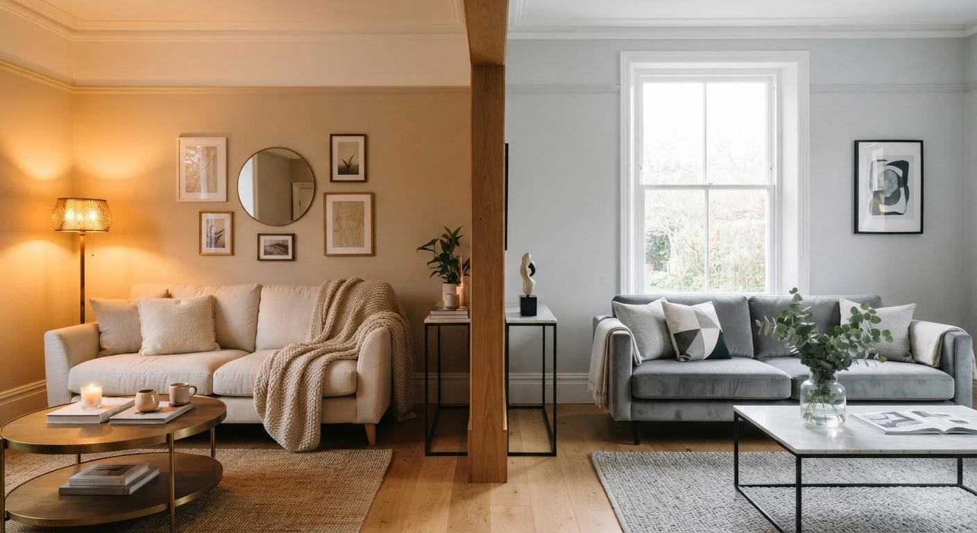
Option A
Warm Neutrals
The cozy, inviting foundation with earthy undertones.
Best for: Rooms where you want a snug, welcoming feel - think living rooms, dining spaces, and bedrooms.
Option B
Cool Neutrals
The crisp, airy base with blue, green, or gray undertones.
Best for: Spaces that benefit from a clean, refreshing feel - including home offices, bathrooms, and modern kitchens.
What Makes a Neutral Warm or Cool?
At first glance, a beige is a beige and a gray is a gray. But pick up two seemingly identical paint chips side by side and you'll quickly notice one reads creamy while the other looks almost lavender. That difference comes down to undertones - the subtle secondary hues hiding beneath the surface of any neutral color.
Warm neutrals carry undertones of yellow, red, orange, or brown. Think classic beige, creamy ivory, sandy taupe, and soft terracotta-adjacent tones. Cool neutrals, by contrast, carry undertones of blue, green, or violet - encompassing pale grays, crisp white-grays, greiges (gray-beige blends), and some sophisticated off-whites.
Understanding this distinction is the foundation of confident decorating. For a deeper dive into how undertones work within broader color principles, see our color theory primer for home decorators.
| Criterion | Warm Neutrals | Cool Neutrals |
|---|---|---|
| Undertones | Yellow, red, orange, brown | Blue, green, violet, gray |
| Mood created | Cozy, inviting, grounded | Crisp, airy, calm |
| Best light direction | North- or east-facing rooms | South- or west-facing rooms |
| Pairs well with | Wood tones, terracotta, brass | Chrome, concrete, whitewashed wood |
| Common examples | Beige, taupe, cream, greige | Pale gray, cool white, slate, greige |
| Design styles | Traditional, farmhouse, Mediterranean | Modern, Scandinavian, industrial |
| Risk if mismatched | Can look yellow or orange in bright sun | Can read cold or stark in dim rooms |
How Light Changes Everything
The single biggest factor in how your neutral reads? The direction your windows face.
- North-facing rooms receive indirect, cooler light all day. Cool neutrals can feel stark or cold in these spaces; warm neutrals add balance and prevent a chilly atmosphere.
- South-facing rooms get strong, warm sunlight for most of the day. A warm neutral may read more yellow or orange than you intended - a cool neutral compensates gracefully.
- East-facing rooms flood with warm morning light and turn cooler by afternoon. Either palette can work; test at both times of day before committing.
- West-facing rooms do the reverse - cool mornings, golden-warm evenings - making them versatile but sometimes tricky with very warm undertones after sunset.
This is exactly why decorators recommend testing large paint swatches (at least 12 inches square) directly on your wall and observing them morning, midday, and evening before purchasing a full gallon. Artificial lighting - especially incandescent or warm LED bulbs - will intensify warm undertones, while daylight-balanced LEDs will keep cool tones truer.
Matching Neutrals to What You Already Own
Paint is usually the last thing applied but shouldn't be chosen in isolation. The undertones already present in your flooring, furniture, and fixed elements like countertops or cabinetry should guide your palette decision.
Hardwood floors with red or orange undertones (common in oak and cherry) will clash noticeably against cool blue-gray walls - a pairing that makes both elements look off. Those floors sing against warm taupes and soft creamy whites. Conversely, gray-toned or whitewashed wood floors and concrete-look tile work seamlessly with cool neutrals.
Upholstered furniture is another big variable. A charcoal sofa with cool blue undertones will look mismatched against a warm honey-beige wall. Pull a single color from a piece you love - a rug, a throw, a tile - and look for the undertone family it belongs to. That's usually your compass.
For room-by-room strategies on coordinating paint with furnishings and accents, our complete room-by-room paint color guide walks you through every space in the home.
Can You Mix Warm and Cool Neutrals?
Yes - and done well, it's one of the most sophisticated moves in interior styling. The key is intentionality. Rather than accidentally clashing undertones, you deliberately layer them for depth and interest.
A popular approach: use a warm neutral on walls to create a cozy backdrop, then introduce cool-toned accents - slate blue cushions, a cool gray area rug, or a white marble-effect side table - to keep the room from feeling heavy or monotone. The contrast adds visual energy while the warm base holds everything together.
The reverse works equally well in more contemporary spaces: cool gray walls anchored by warm wooden furniture, brass hardware, or linen textiles in oat and wheat tones. This technique appears frequently in Scandinavian and modern-transitional interiors.
Explore how these strategies apply across different color schemes in our guide to monochromatic vs. complementary color schemes. And for a full room-by-room look at how to build confidence with paint and accent tones, our colour confidence guide has you covered.
The content on this site is for informational purposes only and is not a substitute for professional advice. Always consult a qualified professional for guidance specific to your situation.