

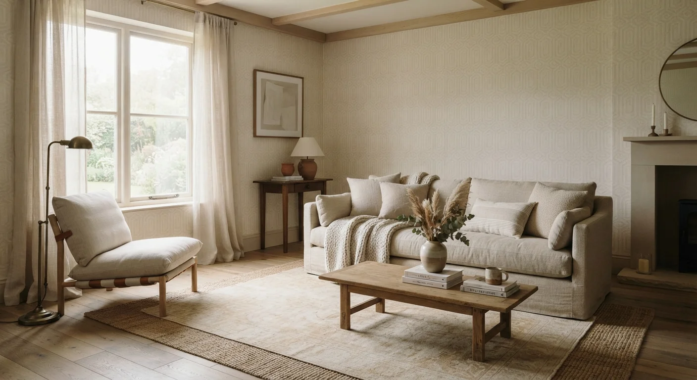
Pattern Doesn't Have to Be Loud
Most people picture bold florals or graphic geometrics when they think of pattern - but the most sophisticated interiors often use pattern in ways that barely register at first glance. Designers have long known that pattern can operate at a near-whisper: building depth, anchoring a palette, and creating rhythm without ever demanding attention.
This approach is especially useful if you love calm, neutral spaces but find them feeling flat or unfinished. The fix usually isn't more color - it's more considered pattern. Whether that means an embossed linen pillow, a painted wall treatment, or a rug with a tone-on-tone weave, the right pattern quietly does the heavy lifting. If you're already thinking about how fabrics and surfaces work together, our guide on adding depth through texture is a natural companion read.
Below, we've rounded up the unexpected methods designers reach for when they want a room to feel rich and complete - without a single obvious print in sight.
Tone-on-tone prints within a single hue
A tone-on-tone pattern uses two shades of the same color - think a cream damask on an ivory background, or a slate-blue herringbone on a mid-blue field. The eye detects movement and structure without reading it as a deliberate pattern. This technique is particularly effective on upholstery, drapery, and bedding, where pattern needs to contribute without competing with other elements in the room.
The key is keeping the value difference subtle. A one- to two-step shift on a tonal scale tends to hit the sweet spot between invisible and overpowering.
Tone-on-tone pattern gives a room structure without ever announcing itself.
Architectural pattern through wall treatments
Paneling, board-and-batten, wainscoting, and ceiling coffers are all forms of pattern - they divide a plane into a repeating grid or rhythm that the eye reads as visual interest. Designers use these treatments to introduce geometry into rooms where a printed wallpaper would feel too busy.
Even simple vertical shiplap creates a directional pattern that makes ceilings feel taller. When painted the same color as the surrounding wall, the effect is quietly dimensional rather than decorative. This is structural pattern at its most restrained. Note that any work involving load-bearing walls or significant modifications may require permits - always check local building codes before making structural changes.
Paneling and molding are geometry - they're just pattern built into the architecture.
Scale variation within a single pattern family
Rather than mixing different types of prints, skilled designers often layer the same pattern at different scales - a large-scale linen check on a sofa paired with a much smaller check on a throw pillow, for instance. This creates a cohesive, collected look that feels rich without reading as chaotic.
The trick is keeping color consistent while letting scale do the differentiation. Our article on using textiles as a decorating tool goes deeper on how scale and fabric weight interact across a room's soft furnishings.
Repeating a pattern at different scales builds complexity without visual noise.
Texture as implied pattern
A bouclé weave, a ribbed cotton, a grasscloth wallcovering - none of these are patterned in a traditional sense, yet each creates a regular visual rhythm that functions like one. In understated rooms, texture IS pattern. The repeating loops of a boucle or the irregular grain of linen provide the same visual relief that a printed fabric would, just with a softer hand.
This overlap between texture and pattern is exactly why layering textures is such an effective technique in neutral spaces - you're essentially building a pattern story through material rather than print.
In a low-contrast room, texture and pattern are functionally the same thing.
Strategic placement over all-over coverage
One of the most counterintuitive designer moves is using a bold or graphic pattern in just one contained area - a single patterned ceiling, an accent wall in a geometric tile, or a patterned runner down a long hallway - while keeping every surrounding surface completely plain. The contrast between the busy and the quiet actually amplifies both.
This approach is especially useful in open-plan spaces, where all-over pattern can quickly overwhelm. Treating pattern as a focal point rather than a ground allows you to enjoy a strong print without living inside it.
A pattern surrounded by quiet reads louder - and more intentionally - than one scattered everywhere.
Natural materials with inherent repeat
Rattan, cane, herringbone hardwood floors, brick, and stone all carry built-in pattern through their construction. A cane-paneled cabinet front introduces a geometric grid; a herringbone oak floor creates a directional zigzag that moves the eye across a room. These patterns feel grounded and organic rather than applied, which makes them particularly suited to spaces that lean toward the calm and natural.
Because these materials pattern themselves through their own structure, there's no risk of the print feeling dated - the pattern is inseparable from the material itself.
Materials like rattan and herringbone oak are patterns you don't have to choose - they arrive already built in.
Bringing It All Together
The common thread across all these techniques is intentionality. Understated pattern works because each choice - a woven weave here, a paneled wall there - is made with the full room in mind. When pattern operates quietly, every element pulls its weight without fighting for attention.
A great way to ground your approach is to start with a patterned piece you already own. Our article on pulling a palette from a patterned piece walks you through exactly how to do that. And if you ever want to push the dial toward something bolder, mixing prints with a clear framework gives you the logic to do it confidently.
Start small, stay consistent with scale and tone, and trust that restraint is its own kind of style statement.
The content on this site is for informational purposes only and is not a substitute for professional advice. Always consult a qualified professional for guidance specific to your situation.