

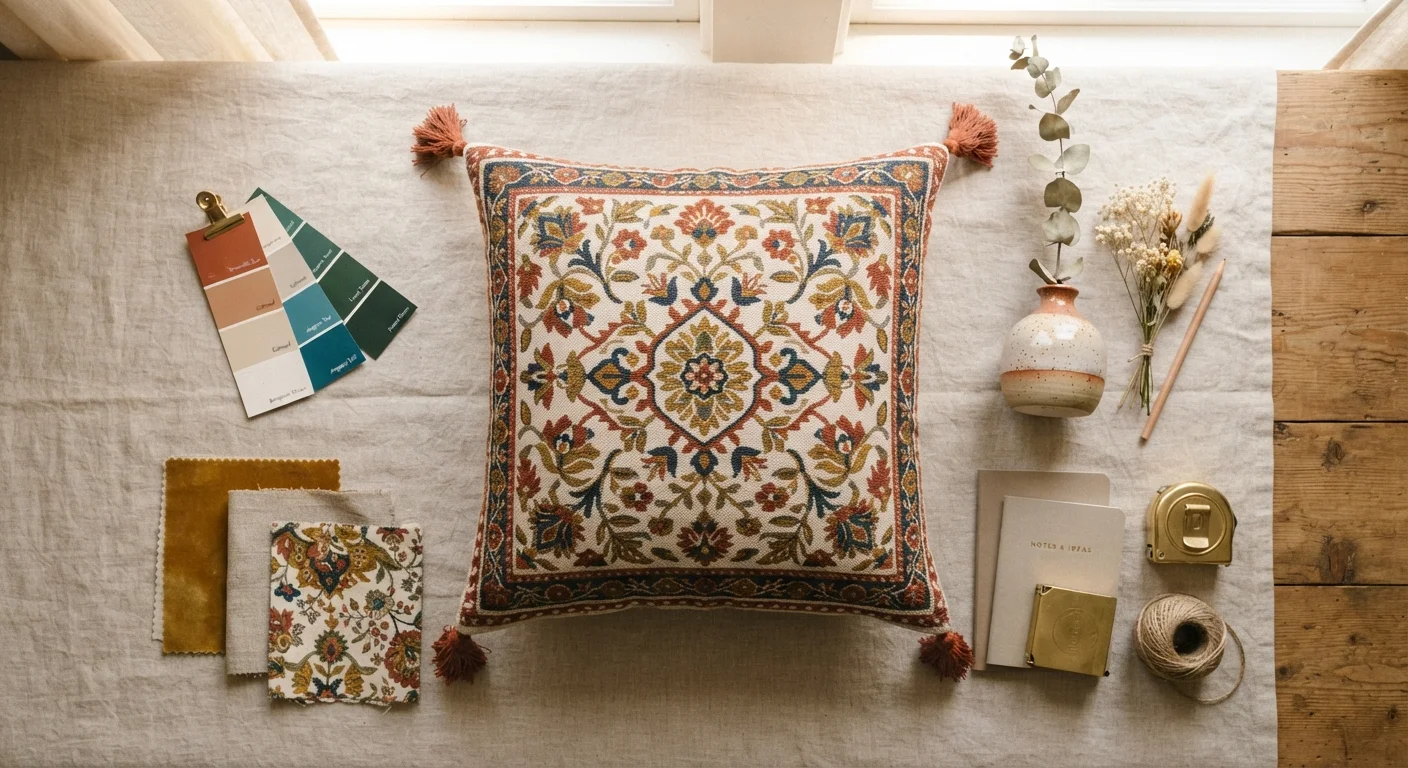
Why Your Patterned Piece Is Already a Color Blueprint
Choosing a room palette from scratch is genuinely hard. Staring at hundreds of paint chips without a reference point is how most decorating projects stall before they start. Here's the good news: if you own a patterned rug, a piece of artwork, a statement cushion, or even a set of patterned curtains that you genuinely love, a professional designer has already done the hard work for you.
Pattern designers and textile artists build color harmony directly into their work. The hues in a well-made patterned piece are chosen to work together - they're balanced for contrast, warmth, and visual weight. When you extract those colors and distribute them across your room, you're essentially borrowing that expertise.
This approach works for virtually any decorating style: a bold geometric rug can yield a modern, graphic palette; a floral textile can unlock soft, layered neutrals with one saturated accent; a piece of abstract art can produce a sophisticated, unexpected scheme you'd never have landed on from a chip alone. If you're working the other way - building a room around a single standout furniture piece - read our companion guide on hero furniture pieces for a complementary framework.
What you will need
How to Extract and Apply Your Palette: Step by Step
Follow these steps in order and you'll walk away with a confident, cohesive palette drawn from something you already love.
Choose your anchor piece and study it in good light
Lay your patterned piece flat - or hang artwork where you can stand back from it - in the best natural light available. Artificial lighting shifts color perception significantly, so daylight (or a daylight-balanced bulb) gives you the most accurate read. Look at the piece as a whole first, then begin identifying individual colors within it.
Identify and list every distinct color in the pattern
Most well-designed patterns contain between three and five distinct colors. Write them down or photograph swatches against the piece. Be specific: note whether a neutral reads warm (cream, camel) or cool (grey, white). Identify which color is most dominant (covers the most surface area), which appears as a secondary accent, and which are the smallest pops of contrast color.
Assign each color a role using the 60-30-10 rule
The 60-30-10 principle is a classic interior design guideline: roughly 60% of the room's color comes from the dominant hue (usually walls, large upholstery, or flooring), 30% from a secondary color (accent furniture, curtains, bedding), and 10% from a pop color (cushions, artwork, accessories). Map your extracted colors to these three tiers. You don't need to use every color equally - the pattern itself already tells you the proportions.
Pull paint chips and test them directly against your piece
Visit a paint counter and pull chips in the colors you've identified. Hold each chip directly against your anchor piece in your home's actual lighting - not the store's lighting. Look for chips that share the same undertone as the color in your pattern. An exact match is rarely possible or even desirable; you're looking for harmony, not duplication. Narrow to two or three candidates per color role.
Build out with textiles and accessories before painting
Before you commit paint to walls, assemble the secondary layer: sourcing fabric samples, cushion covers, or throw options in your 30% and 10% colors. Place them in the room alongside your anchor piece. This low-commitment step often reveals whether a color ratio feels right or needs adjusting - and it's far easier to swap a cushion than repaint a wall.
Once you've landed your palette, consider how textiles beyond your anchor piece - curtains, additional throws, accent rugs - can reinforce those extracted colors. Our guide to using textiles as a decorating tool walks through how fabric, texture, and scale amplify your color choices. And when you're ready to put paint on walls, work through the pre-paint checklist before you commit to a single gallon.
Layering Patterns Without Losing Your Palette
Once your anchor piece is established and your palette is extracted, you may want to bring in additional patterns - a striped throw, a geometric side rug, textured linen curtains. The key is keeping those secondary patterns within the color family you've already defined. A stripe that uses just two of your five extracted colors will read as intentional; a stripe in an entirely new hue will fight your anchor piece rather than support it.
Scale matters too. Your anchor piece should generally be the most complex pattern in the room. Supporting patterns work best when they're simpler in repeat or smaller in scale. If your rug is a large floral, a fine-weave linen or subtle herringbone in a matching neutral makes a perfect companion. For a deeper framework on mixing prints confidently, explore our pattern mixing guide.
Keep Your Anchor Piece Visible While Shopping
When sourcing secondary textiles or accessories, bring a small cutting of your anchor piece's color palette with you - or keep a photo pulled up on your phone. Store and showroom lighting is notorious for shifting color perception. Comparing directly against your reference prevents you from buying items that look coordinated in-store but clash at home.
Finally, don't overlook the role your anchor piece's placement plays in the room's overall composition. A rug used as the palette source, for example, should be sized and positioned to physically connect the key furniture pieces it's inspiring. See our rug placement guide for scale and layering principles that make that connection work.
The content on this site is for informational purposes only and is not a substitute for professional advice. Always consult a qualified professional for guidance specific to your situation.