

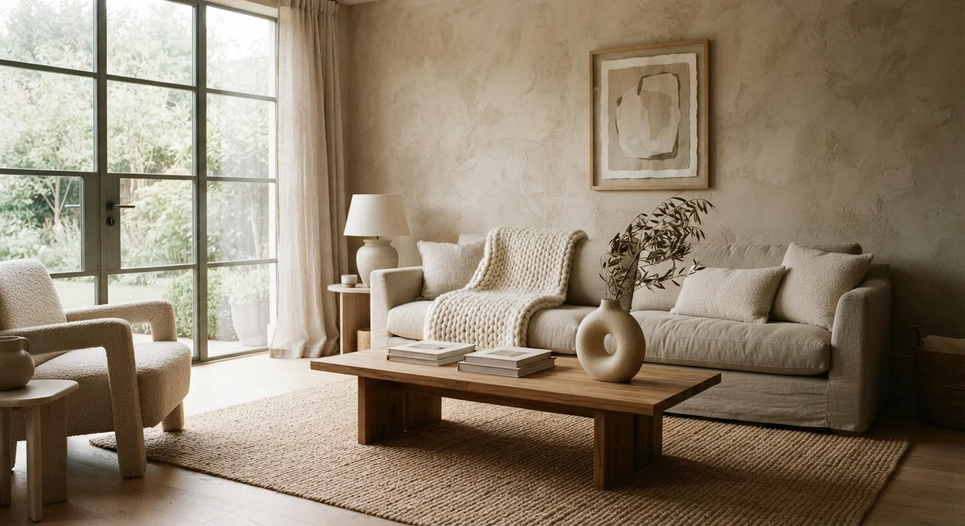
Why Texture Matters More Than Most People Think
Walk into a room where every surface is smooth, every fabric is flat, and every finish is the same sheen - even if the color palette is lovely, something feels off. That something is texture. Texture is the unsung workhorse of great interior design, responsible for making a room feel alive, warm, and three-dimensional rather than staged or sterile.
When designers talk about creating a cohesive, layered space, texture is almost always doing heavy lifting behind the scenes. It's the difference between a furnished room and a styled one. And for anyone working with a neutral palette - whites, creams, greiges, warm grays - texture isn't optional; it's the entire vocabulary you have to work with.
Importantly, introducing texture doesn't require a renovation budget or a single drop of new paint. As explored in our guide to layering textures, the technique is accessible at virtually any price point.
Start With What You Already Own
Before buying anything, do a textural audit of your current space. Gather items from other rooms - a woven basket, a knit throw, a timber tray - and experiment with groupings. You may find you already own enough textural variety; it's simply a matter of arranging it intentionally.
How Texture Creates Visual Depth
Depth in a room is about making the eye travel - noticing different surfaces, pausing on contrasts, moving through the space rather than scanning it and moving on. Color contrast is the most obvious way to achieve this, but texture contrast works by the same principle.
Consider how a rough plaster wall reads next to a glossy ceramic lamp base, or how a nubby boucle armchair looks beside a smooth marble side table. Each pairing creates a conversation between surfaces that pulls the eye in and rewards closer attention. This is sometimes called tactile contrast, and it's a foundational principle in interior styling vocabulary.
Light amplifies these contrasts naturally. Matte surfaces absorb light and create shadow, while reflective ones bounce it back - giving a neutral room genuine tonal variation without any change in hue. This interplay is why a well-textured monochromatic room can feel as rich as one with a full color palette.
3-4
Distinct surface types for a balanced room
Interior designers commonly recommend combining three to four meaningfully different textures - such as rough, smooth, soft, and reflective - to achieve visual balance without overwhelming a space.
~80%
Of a room's visual warmth from soft surfaces
Design educators broadly note that textiles and soft furnishings - rugs, curtains, cushions - contribute the majority of perceived warmth and coziness in a room, often outweighing paint color in effect.
Practical Ways to Layer Texture in Any Room
The most accessible starting point is always textiles. Rugs, cushions, throws, and curtains introduce multiple surface qualities at once - and they're easy to swap out as your taste evolves. A jute rug underfoot, linen drapes at the window, a chunky-knit throw on the sofa, and a velvet cushion or two can completely transform a room's textural register. For more on getting this right, our guide to textiles as a decorating tool covers scale, fabric, and layering in depth.
Beyond soft furnishings, consider these surface-level additions:
- Natural materials: Raw timber, woven rattan, stone, and terracotta all carry inherent texture that adds warmth to neutral spaces.
- Wall treatments: Limewash paint, grasscloth wallpaper, or even a simple plank treatment introduces visual texture at a larger scale.
- Mixed metallics: Brushed brass, matte black iron, and hammered copper each have distinct surface finishes that create textural contrast without color conflict.
- Decorative objects: A hammered bowl, a ribbed vase, a woven basket - small objects with strong surface interest add texture at zero structural cost.
The goal isn't to load every surface - it's to ensure that across the room, the eye encounters enough variety to stay engaged. A workable rule of thumb: aim for three to four meaningfully different surface types working together.
Texture in Context: Complementing Color and Pattern
Texture doesn't exist in isolation - it works alongside color and pattern to shape a room's overall personality. In a room with a bold color palette, too much texture can feel overwhelming; in a muted, tonal space, texture becomes essential. Understanding this relationship helps you calibrate.
If you're ready to introduce color alongside texture, our room-by-room color guide is a natural next step. And for rooms where pattern plays a role, tone-on-tone pattern techniques show how texture and quiet pattern can reinforce each other beautifully.
The most cohesive spaces tend to keep color restrained while letting texture carry the complexity - or vice versa. Rarely do rooms succeed when both are dialed up simultaneously. Choosing your expressive tool and committing to it is what gives a room its confident, intentional feel.
Frequently Asked Questions
Texture doesn't replace color so much as it removes the dependency on color contrast to create interest. In a monochromatic or neutral room, varied textures - rough stone, soft linen, shiny ceramics - generate the visual complexity that color would otherwise provide. The result can feel just as dynamic and considered.
Pairing opposites tends to work well: something rough alongside something smooth, or a matte surface next to a reflective one. Think raw wood beside polished metal, or a chunky knit cushion against a sleek leather sofa. Aim for three to four distinct surface types to avoid both monotony and visual chaos.
Textiles are your most affordable entry point. A woven jute rug, a linen throw, or a set of textured cushion covers can dramatically shift how a room feels for modest outlay. Rearranging existing objects to foreground their surface qualities - a ceramic bowl, a timber tray - also adds textural depth at zero cost.
Yes, noticeably. Rough, matte surfaces absorb light and make a room feel cozier and more intimate. Smooth, reflective surfaces bounce light around and can make a space feel brighter and more expansive. Balancing the two gives you control over a room's perceived brightness and mood.
Tactile texture is what you can physically feel - the nap of a velvet cushion, the grain of a timber shelf. Visual texture is a surface that looks textured but may be flat, such as a grasscloth-effect wallpaper or a printed fabric that mimics linen weave. Both contribute to a room's layered appearance.
It can, especially if every surface is competing for attention. The key is variation with intention - choose textures that differ meaningfully from each other but share a common tonal family. Keeping the color palette tight while varying textures creates richness without visual noise.
The content on this site is for informational purposes only and is not a substitute for professional advice. Always consult a qualified professional for guidance specific to your situation.