

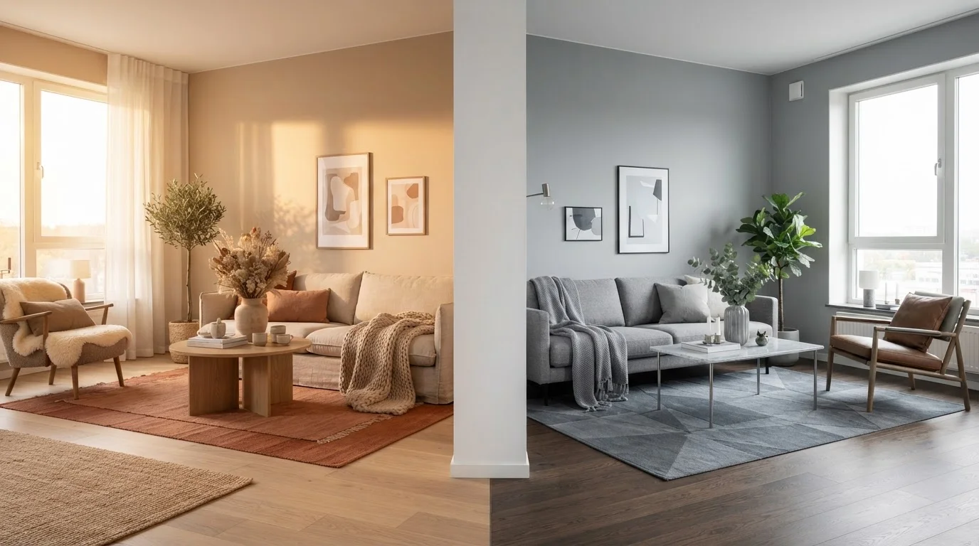
Option A
Warm Neutrals
The cozy, inviting foundation with golden undertones.
Best for: Spaces where comfort, intimacy, and a lived-in glow are the top priorities.
Option B
Cool Neutrals
The crisp, airy backdrop with blue or gray undertones.
Best for: Rooms where brightness, openness, and a modern edge matter most.
What Makes a Neutral Warm or Cool?
Every neutral - no matter how subtle - carries an undertone: a whisper of another hue hiding beneath the surface. Understanding undertones is the key to avoiding that frustrating moment when your "perfect beige" dries on the wall looking distinctly pink or orange. For a deeper dive into how hue and saturation work together, see our color theory primer for home decorators.
Warm neutrals pull their undertones from the red, yellow, and orange side of the color wheel. Think honey beige, creamy ivory, sandy greige (gray-beige), and caramel taupe. Cool neutrals, by contrast, borrow from the blue, green, and violet family - producing shades like blue-gray, lavender-gray, true cool taupe, and crisp white with an icy edge.
The tricky part? Many neutrals sit right in the middle and shift depending on the light source, the hour of day, and the colors already in the room. A greige that looks perfectly balanced in the paint store can lean surprisingly yellow under warm incandescent bulbs at home.
| Criterion | Warm Neutrals | Cool Neutrals |
|---|---|---|
| Undertone family | Red, yellow, orange | Blue, green, violet |
| Common shades | Beige, greige, cream, caramel taupe | Gray, slate, cool white, blue-taupe |
| Best light direction | North- or east-facing rooms | South- or west-facing rooms |
| Mood created | Cozy, intimate, welcoming | Airy, crisp, modern |
| Natural pairings | Wood, brass, linen, terracotta | Marble, chrome, glass, jewel tones |
| Style compatibility | Traditional, farmhouse, transitional | Contemporary, Scandinavian, industrial |
| Risk in low light | Low - holds warmth | Higher - can read flat or cold |
How Light Changes Everything
Light is the single biggest variable in how your neutral reads on the wall - and it's non-negotiable to factor it in before you commit to a color. The direction your windows face affects both the quantity and quality of light your room receives throughout the day.
- North-facing rooms receive indirect, cooler light all day. Cool neutrals can look flat, stark, or even grimy here. Warm neutrals tend to glow and feel balanced.
- South-facing rooms are flooded with bright, warm light. This can push warm neutrals into golden-orange territory by midday. Cool neutrals stay crisp and elegant.
- East-facing rooms get warm morning sun and cooler afternoon light - a flexible canvas for either family.
- West-facing rooms catch intense golden light in the late afternoon, making warm tones feel rich and cool tones feel more comfortable than they might at noon.
Beyond window direction, artificial lighting matters enormously. LED bulbs with a color temperature of 2700K-3000K emit warm light that flatters warm neutrals; 4000K-5000K cool white LEDs enhance the crispness of cool-toned walls. Our room-by-room paint color guide walks through how to account for both natural and artificial light in every space of your home.
Pairing Neutrals with Furniture and Finishes
Your wall color doesn't live in isolation - it has to play well with flooring, furniture, textiles, and hardware. Mismatching undertone families is one of the most common reasons a room feels "off" even when everything seems tasteful on its own.
Warm neutrals pair naturally with:
- Honey oak, walnut, and warm-toned wood floors or furniture
- Brass, gold, and bronze metal accents
- Earthy textiles - linen, jute, terracotta, rust, and olive
- Warm white trim (avoid stark bright white, which creates jarring contrast)
Cool neutrals pair naturally with:
- Pale ash wood, white-washed floors, and gray-toned laminate
- Chrome, nickel, and brushed steel hardware
- Crisp white trim, marble surfaces, and glass
- Jewel-toned accents like sapphire, emerald, or plum for contrast
Mixing undertone families is possible - and can actually add sophisticated depth - but anchor the room with one dominant neutral family and use the other as a deliberate accent rather than an accident. For guidance on building color schemes around your chosen neutral, explore monochromatic versus complementary approaches to see which strategy suits your space.
Testing Before You Commit
Never choose a neutral from a paint chip alone - the sample is too small to reveal how an undertone behaves at scale. Instead, paint at least two large swatches (ideally 12" × 12" or bigger) on adjacent walls and observe them at different times of day: early morning, midday, and evening with your usual artificial lighting switched on.
A few practical tips to keep your swatch test reliable:
- Paint swatches directly on the wall, not on paper - paper absorbs color differently.
- View swatches against your existing flooring and furniture, not in isolation.
- Compare at least two candidates side by side to see which undertone flatters the room more.
- If a color looks dramatically different between morning and evening, it has a strong undertone that will be amplified at scale.
For more room-specific guidance, our room-by-room colour confidence guide covers how to navigate undertones in spaces from kitchens to bedrooms with confidence.
~60%
Walls as dominant color in the 60-30-10 rule
Interior designers commonly apply the 60-30-10 color rule, where the wall color accounts for roughly 60% of a room's visual palette - making undertone choice especially impactful.
2700K-3000K
Warm LED color temperature range
The U.S. Department of Energy notes that bulbs in the 2700K-3000K range produce warm white light that visually enhances yellow and red undertones in paint colors.
12"×12"
Minimum recommended swatch size
Many paint professionals suggest testing swatches of at least 12 by 12 inches directly on the wall to accurately gauge how undertones appear at room scale.
The content on this site is for informational purposes only and is not a substitute for professional advice. Always consult a qualified professional for guidance specific to your situation.