

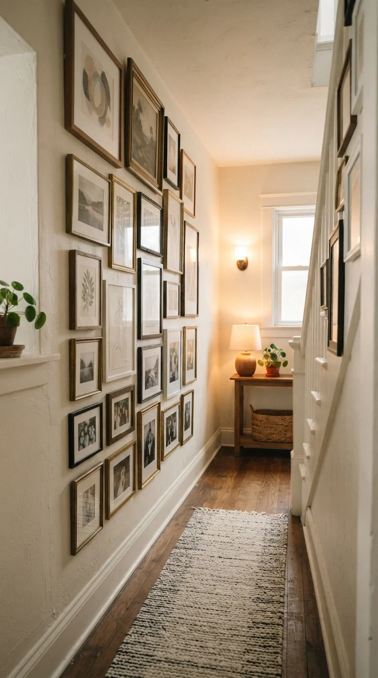
Why Awkward Spaces Actually Make Great Gallery Walls
Odd walls get ignored. The narrow stretch beside a doorway, the low-ceilinged staircase landing, the unused corner that furniture can't quite fill - these spots tend to collect nothing but shadows. But here's the thing: their constraints are actually an asset. A tight boundary forces intentional composition, and intentional composition is what separates a gallery wall that feels curated from one that just feels busy.
The layouts below aren't one-size-fits-all formulas. They're starting frameworks matched to specific spatial challenges, each with a clear visual logic you can adapt. Before you pick up a hammer, check out how to hang gallery walls properly - understanding the common pitfalls first will save you a lot of patching later.
Vertical Column Stack for Narrow Hallways
When your wall is taller than it is wide - think a hallway under 4 feet across - work with that vertical emphasis. A single column or double column of frames, stacked with consistent 2-3 inch gaps, draws the eye upward and creates a sense of height without visually narrowing the passage further.
Keep all frames in the column the same width even if heights vary. This alignment creates a clean edge on both sides of the stack, which reads as intentional rather than cramped. A mix of portrait-oriented artwork works especially well here, since portrait frames echo the tall-narrow shape of the wall itself.
Matching frame widths in a vertical stack creates clean edges that read as deliberate, not crowded.
Horizontal Band Layout for Low-Ceiling Rooms
Low ceilings compress a room visually, and a tall gallery arrangement only emphasizes that compression. The fix: hang your collection in a tight horizontal band at eye level, stretching wide across the wall rather than climbing upward.
Aim for a band that spans at least two-thirds of the wall's width, with all frames sharing the same top edge or center line. This horizontal emphasis tricks the eye into reading the room as wider and more open. Spatial illusion techniques like this one genuinely move the needle in low-ceiling spaces.
A wide horizontal band at eye level makes a low-ceilinged room feel broader and less compressed.
Wraparound Corner Arrangement
Corners are awkward because most layouts simply stop at the edge of one wall. A wraparound gallery wall treats the corner as a continuous surface rather than two separate walls - and the result feels intentional and immersive.
The key is maintaining the same frame spacing and approximate visual weight on both sides of the corner. Use smaller frames near the corner itself, where hanging depth is tightest, and allow larger pieces to anchor each wall's outer edge. A unified color palette across all frames helps the eye read the whole arrangement as one cohesive piece rather than two halves that happened to meet.
Treating a corner as a single continuous surface - not two walls - makes wraparound arrangements feel cohesive.
Diagonal Staircase Grid
Staircase walls present a moving centerline - the visual anchor point rises as the stairs climb. Rather than fight this diagonal, follow it. Hang frames so their centers track the stair angle, creating a diagonal grid that feels dynamic without looking haphazard.
The simplest method: identify the center point of each stair riser, then hang each successive frame about 6-8 inches higher horizontally as the staircase rises. Keep consistent spacing between all frames. Avoid mixing too many frame sizes on a staircase wall; a unified frame size (or two complementary sizes) maintains order in a layout that's already moving in a non-standard direction.
Hanging frames so their centers follow the stair angle creates dynamic rhythm without visual chaos.
Asymmetric Cluster for Oddly Shaped Walls
Walls interrupted by vents, light switches, or irregular angles can't support a perfectly symmetrical grid - and that's fine. An asymmetric cluster leans into the variation. Anchor the layout with one larger central piece, then build outward with smaller frames, letting the cluster grow organically around the wall's obstacles rather than pretending they don't exist.
The rule that holds asymmetric layouts together is consistent negative space: keep the gaps between frames uniform (2-3 inches) even as the overall shape varies. This repetition of spacing creates visual rhythm and prevents the arrangement from feeling scattered. For more ideas on making irregular rooms feel intentional, explore room styling tips that apply beyond gallery walls.
Consistent 2-3 inch gaps between frames give asymmetric clusters their visual rhythm and sense of order.
Single-Row Ledge Display for Rental-Friendly Flexibility
If you're working in a rental - or simply want the freedom to swap pieces frequently - picture ledges mounted in a single horizontal row offer gallery-wall impact with minimal wall commitment. Lean frames at a slight angle rather than hanging them, and layer pieces in front of each other to create depth.
A single ledge works best in spaces where wall height is limited or drilling is restricted. Two ledges at different heights can create a more layered effect. The beauty of this format is that it separates the layout question from the commitment question - you can rearrange pieces any time without touching the wall.
Picture ledges give gallery-wall impact with the flexibility to rearrange pieces without adding new holes.
Bringing It All Together
The best gallery wall for an awkward space is the one that works with the wall's quirks rather than against them. Narrow corridors want height. Low ceilings want width. Corners want continuity. Stairwells want diagonal rhythm. Once you identify what your wall needs, the layout choices become much clearer.
Always mock up your arrangement on the floor first, then transfer it to the wall using paper templates and painter's tape - no guessing, no unnecessary holes. If you're also thinking about how the gallery wall fits into the broader room, creating a strong focal point is a worthwhile next step. And for rooms where the gallery wall is just one piece of a larger small-space puzzle, small room styling strategies offers plenty of complementary ideas.
Test Before You Nail Anything
Cut paper templates to match each frame's dimensions and attach them to the wall with painter's tape before hanging a single piece. This lets you adjust spacing, shift the overall composition up or down, and catch alignment issues while corrections are still easy. Spend 20 minutes with paper and tape, and you'll avoid an afternoon of spackle.
The content on this site is for informational purposes only and is not a substitute for professional advice. Always consult a qualified professional for guidance specific to your situation.