

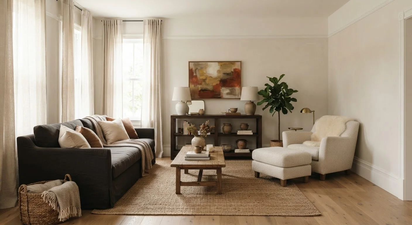
Why Rooms Feel Off - Even When Everything Is 'Nice'
You've arranged the furniture, hung the art, added the throw pillows - and the room still feels wrong. This is one of the most common frustrations in DIY decorating, and the answer is almost never about spending more money. It's about visual weight.
When a room feels unsettled, your eye is registering an imbalance it can't quite name. One area of the space is pulling attention - too dark, too large, too busy - while the rest feels thin and unresolved. You're not looking at an ugly room; you're looking at an unbalanced one.
Understanding visual weight doesn't require design training. Once you see the principle, you can't unsee it - and you'll immediately know what to adjust. For a broader look at which changes tend to make the biggest difference overall, see which room updates deliver the most visual return.
The Four Factors That Control Visual Weight
Visual weight is shaped by four properties - and every object in a room expresses some combination of them:
- Color value: Dark colors absorb light and feel heavy. Light colors reflect it and feel airy. A charcoal sofa carries far more visual weight than an identical one upholstered in cream.
- Scale and mass: Larger objects dominate simply by taking up more visual space. An oversized sectional in a small room isn't just physically large - it is visually overwhelming even if it's a neutral color.
- Texture: Rough, layered, or high-contrast textures draw the eye and increase perceived weight. A smooth, matte surface recedes. Exposed brick reads as heavier than painted drywall of the same area.
- Pattern: Bold, high-contrast patterns punch above their actual size. A small rug with a strong geometric print can anchor a room more than a large solid one. Pattern density matters too - the more complex, the heavier it reads.
Evaluate Elements in Combination, Not Isolation
A large item in a pale, smooth finish might carry less visual weight than a small item in dark, heavily textured material. Always evaluate the combination of color, scale, texture, and pattern together - not each factor on its own. Walk to the doorway and squint to see mass and tone without the distraction of detail.
These four factors interact constantly. A large item in a pale, smooth finish might carry less visual weight than a small item in dark, heavily textured material. Always evaluate the combination, not each factor in isolation.
Symmetrical vs. Asymmetrical Balance - and Why Both Work
Most people default to symmetry when they want a balanced room: matching bedside tables, identical lamps flanking a sofa, evenly spaced artwork. Symmetry is reliable - it signals order almost instantly.
But asymmetrical balance is equally valid and often more interesting. The goal isn't mirroring; it's equivalence. A tall floor lamp on one side of a reading chair can balance a shorter but visually heavier side table stacked with books on the other. Different objects, equivalent visual pull.
This matters practically because you rarely own two of everything. Asymmetrical balance lets you work with what you have. Styling strategies that make small rooms feel larger lean heavily on this principle - using asymmetry to create depth without crowding.
How to Diagnose and Fix an Imbalanced Room
Stand in the doorway of the room and squint slightly. This soft-focus trick strips away detail and lets you see mass and tone instead of individual items. Where does your eye go first? Where does it never go? That tells you where weight is concentrated and where it's absent.
Common imbalances and low-cost corrections:
- One heavy wall, three bare ones: Add visual weight to the lighter walls through artwork, a tall plant, or even a dark-framed mirror. You don't need to add mass - you need to add presence.
- All furniture pushed to the perimeter: This creates a hollow center. Pull at least one piece slightly inward and add a rug to anchor the middle of the room.
- Everything at the same height: Flat arrangements feel static. Vary the height of lamps, plants, and objects on shelves to create vertical rhythm.
- Color clustering: If all your bold or dark items are on one side, the room will tilt. Distribute anchors - a dark throw, a bold cushion, a plant - across zones to spread the visual load.
For rooms where scale is a compounding problem, spatial tricks that genuinely affect perceived space covers how mirrors and vertical lines interact with visual weight distribution.
Visual Weight and Color: The Connection Most People Miss
Color is the fastest lever for shifting visual weight - and it's often the cheapest. Paint a single wall a deep tone and that wall immediately anchors the room. Add two dark accent pillows to an armchair and it suddenly holds its own against a large sofa across the room.
Color proportion matters enormously here. The 60-30-10 color rule provides a practical framework for distributing color so that one tone dominates, a second supports, and a third accents - which naturally manages visual weight across the room without requiring perfect spatial balance.
The practical takeaway: before you rearrange or buy anything, look at your color distribution. Shifting the placement of existing dark or bold items often resolves an imbalance faster - and cheaper - than any furniture move.
This article is for informational purposes only. Design outcomes vary depending on room dimensions, lighting conditions, existing furnishings, and personal preference. Results described are illustrative, not guaranteed.
Frequently Asked Questions
When large, dark, or heavily textured items concentrate on one side of a room, the eye registers that area as dominant. The opposite side feels sparse or unresolved by comparison. Redistributing those elements - or adding visual weight to the lighter side - corrects the imbalance.
No. Wall color, artwork, rugs, window treatments, lighting fixtures, and even plants all carry visual weight. A dark accent wall, for example, can anchor an entire room without a single furniture change.
Yes. A small sculpture in a shiny, dark finish or a cluster of bold-patterned throw pillows can carry significant visual weight relative to their size. Pattern density and contrast amplify perceived weight.
Not necessarily. Symmetrical arrangements look balanced, but asymmetrical arrangements - where different items carry equivalent visual weight - can feel more dynamic and relaxed. Many well-designed rooms use asymmetry deliberately.
Start by identifying what's pulling the most attention - usually a large, dark, or bold item. Then introduce lighter elements on the opposite side: a bright throw, pale artwork, or reflective accessories. Sometimes simply moving an existing piece is enough.
Yes. Low ceilings compress visual weight downward, making heavy furniture feel more dominant. Tall ceilings provide vertical space that can absorb weight through taller artwork, floor lamps, or shelving. Vertical elements help draw the eye upward and rebalance the room.
The content on this site is for informational purposes only and is not a substitute for professional advice. Always consult a qualified professional for guidance specific to your situation.