

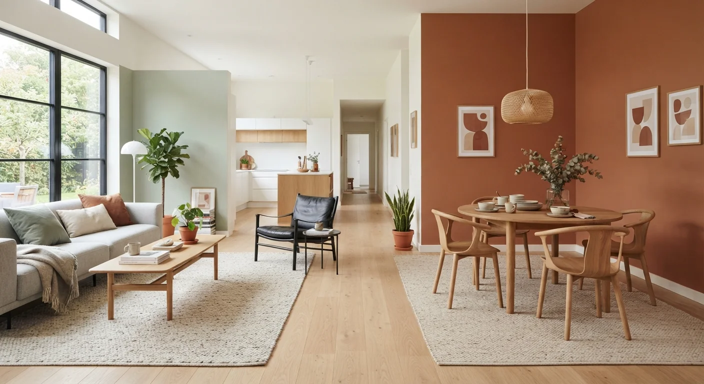
What Color Zoning Actually Means
Color zoning is the design practice of using paint colors, textiles, and pattern to signal distinct functional areas within a single open-plan space - no walls, partitions, or major construction involved. Think of it as visual architecture: your eye reads a zone boundary the same way it reads a doorway, even when the floor plan is completely open.
The technique works because the human brain naturally groups objects that share similar colors or textures. When your dining area seats are wrapped in warm amber tones while the lounge behind it reads in cooler sage, the brain files those two clusters as separate rooms - and the space feels organized rather than chaotic.
Before diving into steps, it's worth understanding two foundational ideas. First, the 60-30-10 color rule gives you a reliable ratio for distributing color across any zone so it never feels unbalanced. Second, visual weight principles explain why darker, denser colors feel heavier - knowledge that directly informs which hue you assign to each zone's anchor pieces.
Tools and Materials You'll Need
Color zoning is refreshingly tool-light. Most of what you need is already in your home or easy to source without a major budget commitment.
Paint samples and swatches
Test candidate wall colors directly on your walls under different lighting conditions before committing.
Area rugs (one per zone)
Anchor each functional zone on the floor - the single most impactful zoning element in an open plan.
Painter's tape
Temporarily map zone boundaries on the floor or wall so you can evaluate proportions before painting.
Color wheel or digital palette tool
Identify harmonious hues and check contrast levels between zone palettes.
Fabric swatches or textile samples
Audition accent textiles - cushions, curtains, throws - alongside paint colors before purchasing.
Once you've gathered your materials, take a few minutes to photograph your space in natural daylight. Photos reveal color cast and proportion issues that are easy to miss in person - a quick snapshot can save a lot of second-guessing later.
Step-by-Step: Defining Your Zones With Color
Follow these steps in sequence. Rushing ahead to paint or purchase before mapping your zones is the single most common reason open-plan color schemes go sideways.
Map Your Zones on Paper First
Sketch a simple floor plan - it doesn't need to be precise, just proportional. Label every functional area: cooking, dining, lounging, working, reading. Assign each a zone name. Most open-plan spaces have two to four zones; more than four becomes hard to manage visually.
Note the flow of natural light across the floor plan at different times of day. South-facing light is warm and forgiving; north-facing light is cooler and can make some colors look flat. This affects which hues will perform well in each area.
Choose a Unifying Neutral for All Zones
Before selecting zone-specific accent colors, lock in one shared neutral that will run through the entire space - typically on the ceiling, trim, or a dominant wall. This neutral is the visual glue that stops your open-plan space from feeling like a patchwork quilt.
Warm whites, soft greiges (a blend of gray and beige), and light warm taupes tend to perform well because they read differently under varied lighting without clashing with most accent palettes.
Assign a Distinct Accent Palette to Each Zone
Each zone gets its own accent color or pattern family - applied through wall paint, a dominant textile (rug, curtains, sofa upholstery), or both. The key constraint: every zone's accent must share at least one quality with the others. That quality can be temperature (all warm, all cool), saturation level (all muted, all vivid), or undertone family (all earthy, all jewel-toned).
For example: dining zone in warm terracotta, lounge zone in dusty rose, reading nook in amber. All three are warm-toned and muted - distinctly different, but clearly part of the same family.
Anchor Each Zone With an Area Rug
Place an area rug in each defined zone. The rug should be large enough that all primary furniture legs - or at least the front legs - rest on it. This physically anchors the zone and makes the boundary intuitive to read even from across the room.
Vary the rug pattern scale between zones: use a bold, large-repeat pattern in your primary zone (typically the lounge) and a smaller-scale or solid rug in secondary zones. This hierarchy reinforces which area is the visual anchor of the space.
Use Vertical Elements to Reinforce the Boundary
Floor-level zoning works well, but adding a vertical element - a painted accent wall, a cluster of framed art, open shelving, or a pendant light positioned over a dining table - locks in the zone boundary at eye level and above. This matters because people navigate and read spaces primarily at standing eye height.
A pendant or chandelier hung low over a dining table is especially effective: it creates an implied ceiling over the zone and immediately signals "this is the dining area" without any wall required.
Test, Live With It, Then Adjust
Before finalizing any paint color, live with large painted samples for at least a week. Colors look different at morning, midday, evening, and under artificial light. A sage green that feels calm at noon can read almost gray on a cloudy afternoon.
Once paint is applied and furniture is placed, take new photos from your main entry point and from across the room. Distance reveals whether zones read as distinct or blend into each other. Small adjustments - swapping a rug, adding a throw, repositioning a floor lamp - can resolve most readability issues without repainting.
For further guidance on choosing palettes once your zones are mapped, see our complete room-by-room color guide, which covers light direction, finish types, and flow between adjacent spaces.
Troubleshooting Common Color Zoning Problems
Even well-planned schemes can hit snags. Here are the most frequent issues and how to address them without starting over.
- The zones feel disconnected or jarring
- You likely have too much contrast between zone palettes with no shared thread. Introduce one repeating accent color - a throw pillow, a vase, a plant pot - that appears in at least two zones. This creates visual dialogue without merging the zones.
- One zone dominates the whole room
- A very dark or saturated color in one area pulls attention so strongly that other zones disappear. Either lighten the dominant zone's wall color by a few shades, or add visual weight to quieter zones through darker furniture legs or a boldly patterned rug.
- The space still feels like one big room
- Pattern scale may be too uniform. Try scaling up the rug or textile pattern in your primary zone - a larger-repeat pattern reads as more visually distinct from a distance.
If you're drawn to a single-color approach for the whole space, monochromatic versus complementary color schemes explores how to achieve tonal variety within one hue family - a useful technique when you want cohesion without sameness.
The content on this site is for informational purposes only and is not a substitute for professional advice. Always consult a qualified professional for guidance specific to your situation.