

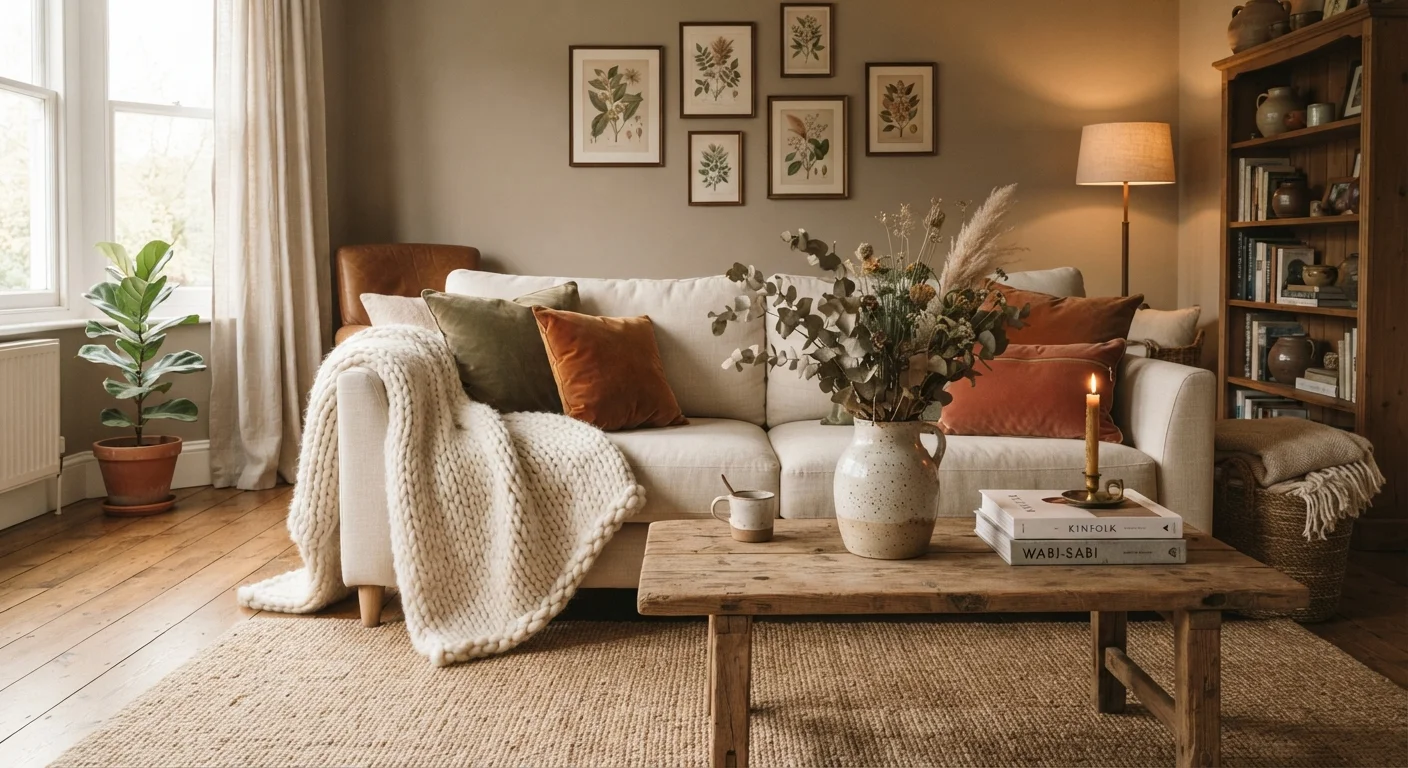
Why Texture Is the Missing Ingredient in Most Rooms
Most decorating advice focuses on color, furniture scale, or layout - and all of that matters. But there's a quieter force that professional stylists rely on constantly: texture. Walk into a room that feels genuinely cosy and inviting, and you'll find it's rarely one dramatic statement making the difference. It's the interplay of surfaces - the rough against the smooth, the soft against the hard, the matte against the shiny.
Texture layering is what gives a room its feel, both literally and figuratively. It signals warmth, effort, and personality in a way that a matching furniture set simply can't. The good news? It's one of the most accessible techniques available, because many of the best texture tools - throws, cushions, baskets, rugs - are also among the most affordable decorating elements you'll find.
For a deeper grounding in the vocabulary behind this technique, our plain-English styling glossary is a helpful companion read.
The Core Principles of Texture Layering
Effective texture layering isn't random - there's a loose framework that keeps rooms looking intentional rather than cluttered.
Contrast Is the Engine
Texture only registers when it's placed next to something different. A chunky knit cushion on a linen sofa reads clearly. The same cushion against a matching knit throw blurs together. Aim for contrast in surface quality: pair something rough with something smooth, something woven with something sleek.
Vary Scale Across Textures
Just as you'd mix large and small patterns, mix large-grain and fine-grain textures. A wide-weave jute rug works beautifully alongside tightly woven cushion fabric and the fine grain of a timber side table. The variation in scale keeps the eye moving without creating confusion.
Repeat Textures to Create Cohesion
Introduce a texture in one spot, then echo it elsewhere in the room. A rattan basket by the sofa that's echoed in a rattan mirror frame ties the space together. Repetition creates a sense of design intention rather than coincidence.
Balance Hard and Soft
Rooms that rely entirely on soft furnishings can feel formless; those with only hard surfaces feel cold. The most grounded interiors mix both. Think: a stone or ceramic lamp base alongside a velvet shade, or a wooden tray holding soft linen napkins.
The Black-and-White Photo Test
Snap a quick photo of your room and convert it to black and white on your phone. Without color doing any work, you'll see immediately whether your texture layering is creating enough contrast and visual interest. If everything blurs together at the same tone, it's time to introduce a rougher or lighter-surfaced element.
Where to Layer Texture in a Room
Every surface and zone in a room offers texture opportunity. Here's how to think through each one:
- Floors: A rug is your biggest texture statement after the sofa. Layering two rugs - a flat-weave base under a shaggy or jute topper - is a technique that adds enormous depth. See our guide to rug placement and layering for the full breakdown.
- Seating: Cushion covers in mixed fabrics (linen, velvet, woven cotton) are one of the fastest texture upgrades available. Vary the fabric, not necessarily the color, to keep things harmonious.
- Walls: Wallpaper with a raised or embossed finish, wood paneling, exposed brick, or even a gallery arrangement with mixed frame finishes all add wall texture. Texture as a design tool explores how to approach this without repainting.
- Surfaces and shelves: Group objects with different materials - a matte ceramic vase next to a polished wood box next to a woven tray. The contrast between them is the point.
- Window treatments: Fabric weight matters here. A linen or cotton curtain reads completely differently to a heavy velvet drape - and both read differently from a bamboo blind. Textiles as a decorating tool covers the full picture of how soft furnishings interact.
Lighting, too, amplifies the effect of texture. Raking light from a side lamp across a woven wall hanging or rough plaster makes texture visible in a way overhead lighting never does. Layering your lighting is worth tackling alongside your texture work.
73%
of interior designers cite texture as a primary tool
According to a survey published by the American Society of Interior Designers (ASID), the majority of design professionals rank texture alongside color as one of their most frequently applied layering strategies.
3-5
distinct textures recommended per room
Widely cited in professional styling guides, using three to five contrasting surface qualities per space balances visual richness with cohesion.
$0-$50
cost range for impactful texture additions
Throws, cushion covers, woven baskets, and small ceramics - the most effective texture tools - are commonly available at accessible price points, making this one of the most budget-friendly decorating strategies.
Texture Layering on a Budget
The beauty of this technique is that it rewards resourcefulness. Unlike furniture, the elements that carry the most texture - throws, cushions, baskets, plants, candles, small ceramics - are also among the most budget-friendly to swap, source secondhand, or DIY.
A few practical approaches:
- Start with what you have. Pull every cushion, throw, and decorative object out of storage and look at what surfaces they offer. You may have more textural variety than you realize - it just needs styling, not spending.
- Prioritize high-impact zones. The sofa and the coffee table surface together carry the most visual weight in a living room. Even a single new textured element in each zone makes a noticeable difference.
- Mix materials intentionally. A wicker basket from a dollar store placed next to a simple ceramic plant pot creates texture contrast for almost nothing.
- Layer patterns and texture together. Woven, printed, and embroidered textiles all contribute visual texture, not just tactile texture. Pattern mixing principles apply directly here and help you build complexity without clutter.
Texture layering isn't about buying more - it's about making what's already in the room work harder together. Once you train your eye to see surfaces as design elements, even a minor rearrangement can make a room feel noticeably more intentional and inviting.
Frequently Asked Questions
Three to five distinct textures is a widely used guideline among stylists. Too few and the room feels flat; too many without intention can feel chaotic. Start with a dominant texture (like linen on your sofa), add a contrasting one (chunky knit throw), then build with smaller accents such as ceramic or wood.
Absolutely. In small spaces, texture does the work that color and pattern can overwhelm - it adds interest without visually shrinking the room. Keep your palette tight and let material variety provide the depth. A jute rug, linen curtains, and a velvet cushion go a long way in a compact bedroom.
Soft furnishings are your most cost-effective entry point. A single chunky throw, a set of mixed-fabric cushion covers, or a woven basket can instantly lift a room. Thrift stores and discount home sections are worth exploring for tactile pieces like wooden bowls, ceramic vases, and woven trays.
Not at all. Hard materials contribute significantly - wood grain, matte stone, brushed metal, and glazed ceramic all add texture. In fact, mixing hard and soft textures (like a rough jute rug against a smooth painted floor) is one of the most effective contrasts you can create.
Step back and squint at the room - if it feels visually interesting without looking cluttered, you're on track. Another test: photograph the space in black and white. Without color as a guide, you'll quickly see whether the variation in surface quality and tone is doing enough work on its own.
The content on this site is for informational purposes only and is not a substitute for professional advice. Always consult a qualified professional for guidance specific to your situation.